
When choosing my top Colors of the Year, I’m looking for colors that INSPIRE. Colors that talk to people (mind you, every color talks to me after a few glasses of wine). Colors that have you thinking, ‘You know what? Maybe I’ll step outside my comfort zone and try it – why not!’
While some colors chosen by the big brands are only good on a new car or fresh pair of undies (Caliente, anyone?), others (like the ones I choose) are just begging to be slapped on your walls, cabinets, doors, and exteriors.
But first (or head first – one of my favorite jokes)…
WHAT’S KYLIE M’S PROCESS FOR CHOOSING HER COLORS OF THE YEAR
First off, it’s agonizing – I can’t even tell you. Colors are like my children, and I love them all the same for different reasons. Just joking – I DEFINITELY play favorites.
Here’s the general process…
1. Choose this month’s fave wine and insert funnel and straw.
2. Break down each color group, i.e., blue, green, beige-tan, gray, white, etc…
3. Focusing on one group at a time, I consider colors my clients have asked for in the previous months and how these relate to where trends could be SHIFTING.
4. Narrow it down to my favorite three colors within each color group, and from there…
5. Consider each color’s usability on the following surfaces…
- cabinets, islands, and/or bathroom vanities
- accent walls
- entire rooms or even WHOLE HOMES
- trims
- doors (interior and exterior)
- exterior siding
6. Consider any shifts I’m seeing on my Instagram feed
From there, I don’t just pick the colors with the most checked boxes; I combine these with my knowledge of WHAT PEOPLE TEND TO LIKE.
Why does this matter?
Because most people buying paint are ordinary people with average homes…
REAL PEOPLE & REAL HOMES NEED REAL COLORS.
Sure, we’ve got a few billionaires here and there or the eccentrics who crave the wild and wonderful, but in the residential paint world…
Most of us are just looking for pretty colors that get us excited to paint.
Sherwin William’s 2023 Coty, Evergreen Fog, is still a super popular shade of green
ARE THESE COLORS OF THE YEAR NEW & EXCITING?
You might expect my colors of the year to vary wildly from year to year. Look at Benjamin Moore’s choice of Raspberry Blush, followed by this ravishing shade of violet-blue. As for Sherwin Williams’s previous choice of Old Bologna, I mean, Redend Point, it’s DRASTICALLY different from the next year’s subtle shade of purple-blue – Upward.
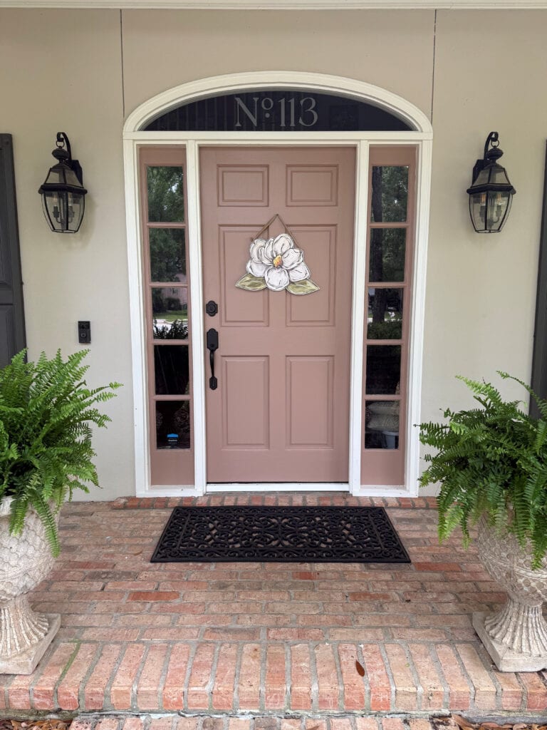
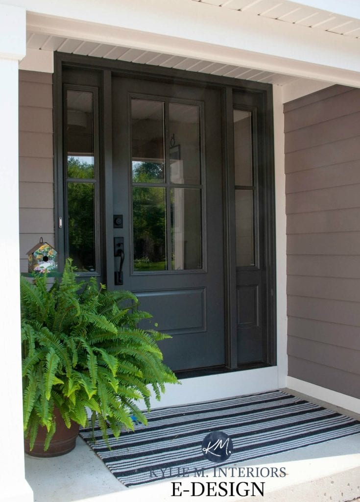
While it wasn’t a hit for most people, Redend Point was the perfect choice for my client’s front door.
Unlike the big brands, I’m not looking at high design, commercial spaces, or fashion when looking for my color inspirations – I’m looking at YOUR HOME AND YOUR TASTES. I explore current trends and consider how they’re shifting to see where things are going in the coming year (again, based on my Instagram feed and Online Consulting clients). This means this year’s colors are often variations or tweaks of LAST year’s colors.
Why?
While trends can shift, it takes a lot for a ‘wild and wonderful new color’ to come on the scene without SOME kind of warning or warm-up. So, while I’d love to throw down some wild color that gets people talking, I’d rather just show you what I believe you’ll be looking for…
Colors that have a darn good chance of looking good SOMEWHERE in or on your home.
By the way, I talk this much in real life, too. NOW LET’S GET THIS PARTY STARTED!
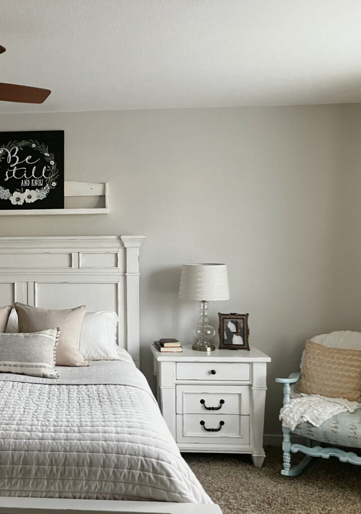
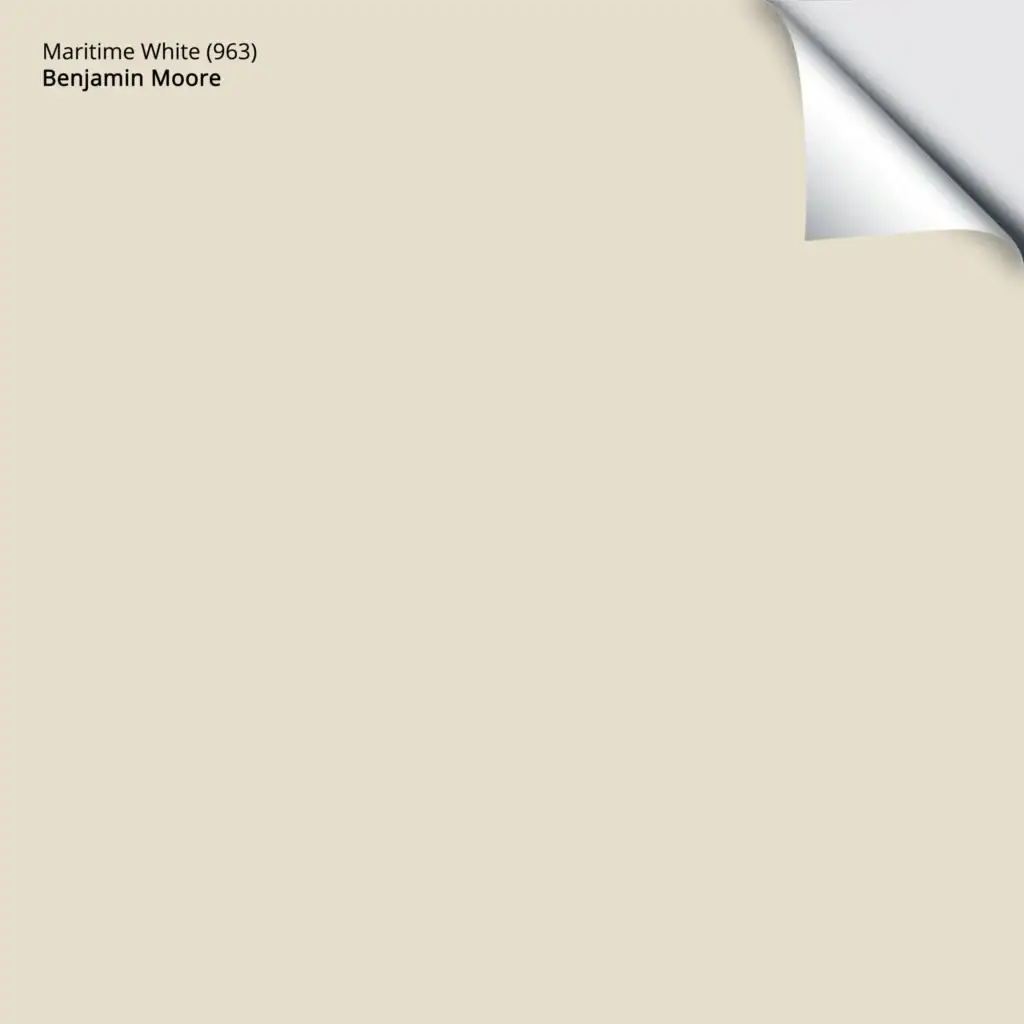
1. BENJAMIN MOORE MARITIME WHITE OC-5
Not everyone is ready for the warmer end of beige (myself included), but many are tired of gray, greige, and taupe. PERSONALLY, it’s about the right color, in the right depth, in the right spot. However, with trends officially in the warm world and shifting OUT of the ‘white on white’ trend, Maritime White is one of the first colors to come to mind.
Maritime White walls, White Dove cabinets, Antique Pewter lowers
Contrary to its name, Maritime White isn’t white. Nor is it super beige or cream – it’s a hybrid of sorts. While it might lean a bit more toward beige than anything, it’s definitely not typical for those who think they’re averse to beige, as it has a touch of gray to soften it.
What’s great about a color like Maritime White is its lack of commitment, which makes it flexible and ready to suit a wide and wild range of interior finishes. Maritime White is FLEXIBLE, it’s WARM, and it’s ready for you (sounds like a hot date, right?)
Why Maritime White?
More and more, my Online Color clients are leaning into and loving their homes (hopefully, thanks to my blog)…
They’re picking paint colors based on the home they have, not the home they WISH they had.
Homeowners aren’t fighting their homes as much (and I hope I’ve been part of that shift) – trying to get white cabinets where white doesn’t fit or gray walls where beige will be better. Sure, there’s no harm in trying – there’s often a happy medium…
But sometimes there’s something even better…the perfect color.
The Best Off-White Paint Colors
WHERE DOES MARITIME WHITE LOOK BEST?
- Unlike more colorful options, a neutral like Maritime White can suit an entire home (these colors are great for your whole home, too).
- In single rooms
- Exterior siding, as it’s often suited to stone and brickwork.
- Kitchen cabinets, especially given the off-white/light depth cabinet trend.
Get your PEEL & STICK SAMPLE OF MARITIME WHITE
WHAT COLORS ARE SIMILAR TO MARITIME WHITE
A few colors were in the running with Maritime White, but didn’t make the cut (for various reasons). A few of these are very similar to Maritime White in depth and intentions; others are similarly warm, but have a bit more depth.
It’s important to sample and compare a range of colors to see how each settles in your lighting conditions and with your finishes.
- Benjamin Moore Muslin offers a bit more depth
- Sherwin Williams Moderate White has a bit more warmth/intention
- Sherwin Williams Divine White (the first one kicked off the list – pretty, but not neutral enough)
- Sherwin Williams Natural Linen (darn close to making the cut).
Benjamin Moore Maritime White COLOR REVIEW
2. SHERWIN WILLIAMS BALANCED BEIGE 7037
For those who want that soft, organic, almost cashmere-inspired look, Balanced Beige is a beauty.
While its lighter cousin, Accessible Beige, is also an option, many are reaching for slightly darker shades, especially for their cabinets and walls. Rather than being bright and cheerful (like Maritime White), Balanced Beige offers a softer, slightly moodier look (without too much visual weight).
Balanced Beige has an LRV (light reflectance value) of 46, making it a light-medium color. It has minimal undertones (not as inclined toward green as some beige-tans or pink like others), and it’s known to be a pretty great happy medium. Could it look a bit taupe? Yeah, it has a touch more gray than many beiges.
Why is it one of my Colors of the Year?
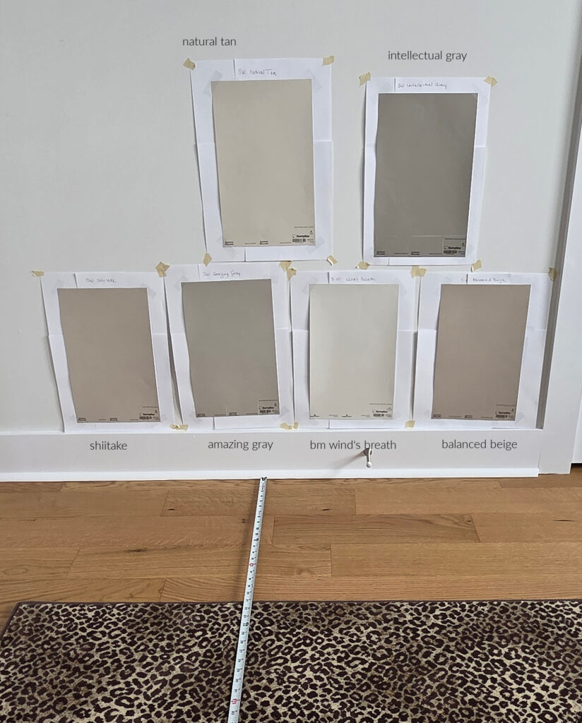
OTHER REVIEWS: SW Natural Tan | SW Intellectual Gray | SW Shiitake | SW Amazing Gray | BM Wind’s Breath
Again, while many homeowners or renters want a lighter, brighter look as they shift away from the white trend, others are ready to shift gears into a more organic, muted softness.
Sherwin Williams Balanced Beige COLOR REVIEW
WHERE DOES BALANCED BEIGE LOOK BEST?
- It’s a fabulous choice for your whole home, especially if you want a softer look that offers a bit more contrast with white trim. Just be careful in those dark hallways!
- Great for open-concept spaces or single rooms.
- Exterior siding/stucco can look great in this beige – just notice how it shifts if you have south-facing or strong afternoon western sun.
- Kitchen cabinets can look gorgeous in this color.
WHAT COLORS ARE SIMILAR?
Again, sampling and comparing is THE BEST WAY to find your best paint color…
- Sherwin Williams Accessible Beige offers a similar, lighter look.
- I also love Sherwin Williams Shiitake, as do many of my clients
- Sherwin Williams Sand Bar approaches beige-tan with slightly different undertones (the way it leans) – check it out and see which your home’s lighting and finishes prefer.
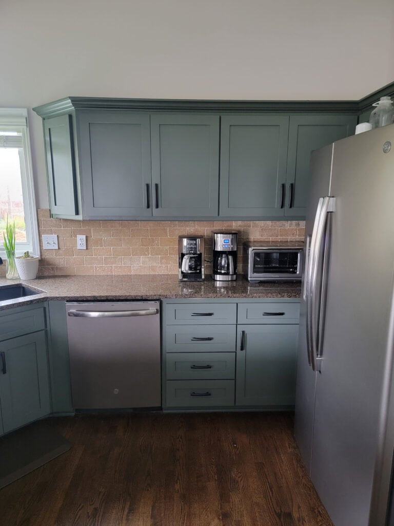
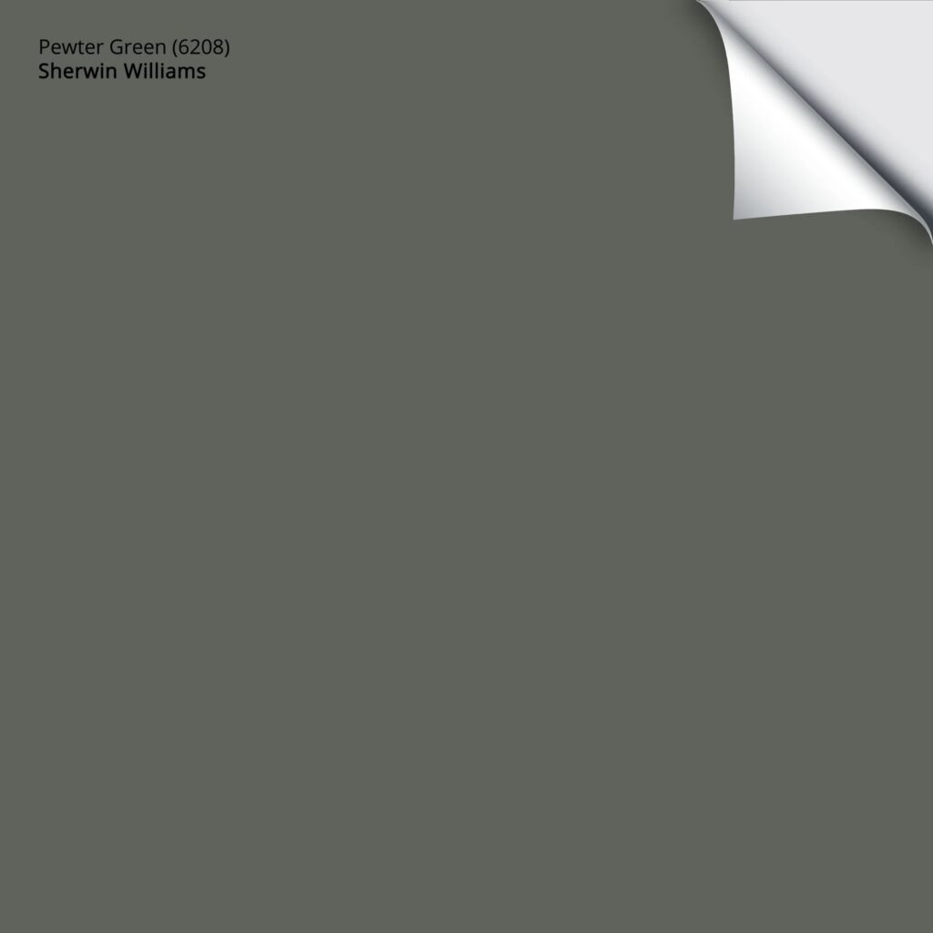
3. SHERWIN WILLIAMS PEWTER GREEN 6208
If you’re looking for a green paint color with depth, without too much darkness, with COLOR but not too much intensity, Pewter Green could be your shade.
With an LRV of 12, Pewter Green is a medium-dark shade of green and clearly shy of dark greens that read as green-black. As for its degree of color (chroma), Pewter Green commits to green but has a reasonable gray backdrop, calming it down. While it’s not a gray-green by any stretch, it’s FAR from Kelly or Emerald Green.
Ideas to Update Your 1990s Kitchen
Why is Pewter Green one of my Colors of the Year?
Pewter Green hits green in all the right places, offering a commitment to green, without being punched in the face by Kermit the Frog. It’s moody, earth-toned, and WILDLY flexible with a variety of finishes. I almost bumped it up to Sherwin Williams Retreat, which is a more consistent medium-depth shade of green. And while both will have their place in the coming year, we still love those dark hues.
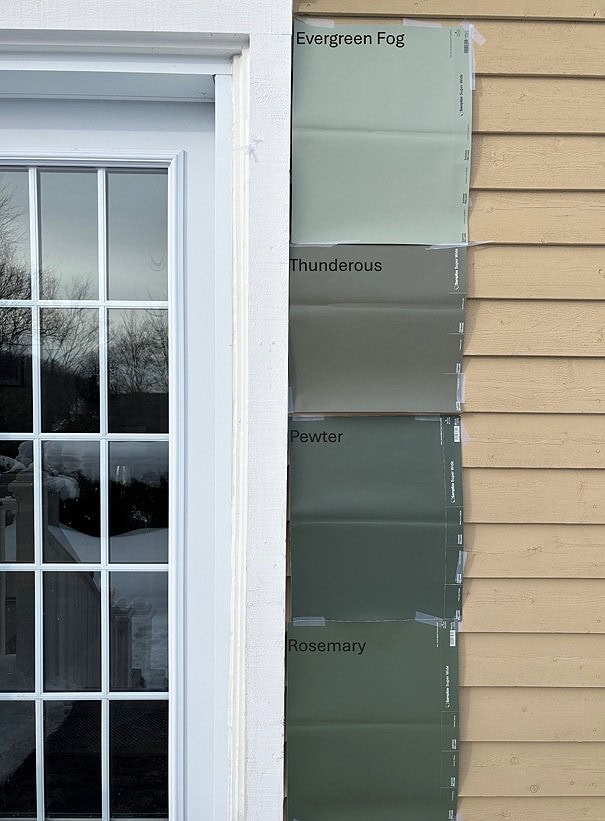
OTHER REVIEWS: SW Evergreen Fog | Explore the other greens in this dark green group blog post. Also, the 3rd one down should say Pewter GREEN.
While the dark green cabinet trend has softened into lighter, softer shades, many still want a strong color like this, either for all their cabinets or their kitchen island.
Let’s look at a few places Pewter Green can be used…
WHERE DOES PEWTER GREEN LOOK BEST?
- as an accent wall
- on exterior siding or a front door
- kitchen cabinets (the whole kitchen)
- kitchen islands and bathroom vanities
- an entire room (a small bathroom would look wicked in Pewter Green)
Get your PEEL & STICK SAMPLE OF PEWTER GREEN
Long story short, green isn’t going anywhere in 2026. Sherwin Williams Evergreen Fog was 2023’s COTY, and it’s stunning and still in high demand. Benjamin Moore rocked the color world with October Mist in 2022, and I still get requests for it.
Green is timeless; it just comes down to the right color, in the right depth, in the right spot.
2026 has us exploring these mid-toned greens and DARKER shades of green, especially Pewter Green.
Sherwin Williams Pewter Green COLOR REVIEW
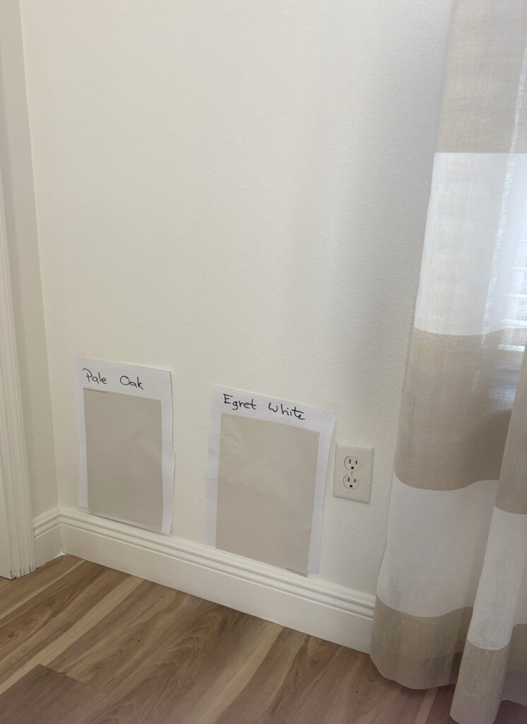
4. BENJAMIN MOORE PALE OAK OC-20
Pale Oak is one of my favorite colors among ‘pretty, gentle’ shades.
The Best Paint Colors with Wood Finishes
Pale Oak is a taupe paint color with an LRV of 68.64; it sits in a really great place between off-white and light. It has a soft, gentle freshness that isn’t overly warm or cold (though that can be subjective).
Why did I choose it as one of my Kylie M. Colors of the Year?
Again, I eagerly await more photos of clients who’ve painted with this color; it’s EASILY one of the more talked-about shades (in this range).
WHERE DOES PALE OAK LOOK BEST?
- Single rooms, for sure.
- It goes well in open-concept spaces. Some even consider it for their whole homes (just make sure each room’s finishes/lighting suit it).
- Exterior siding or stucco – it can be gorgeous as many homes suit its hint of taupe-pink.
- It’s popular on cabinets, though be careful of those pink hues!
COLORS TO SAMPLE & COMPARE
Oh, I’ve got some good ones for you…
- Sherwin Williams Egret White (coming up shortly)
- Sherwin Williams City Loft is an awesome alternative
- Check out Benjamin Moore Balboa Mist if you want a bit less warmth
Benjamin Moore Pale Oak COLOR REVIEW
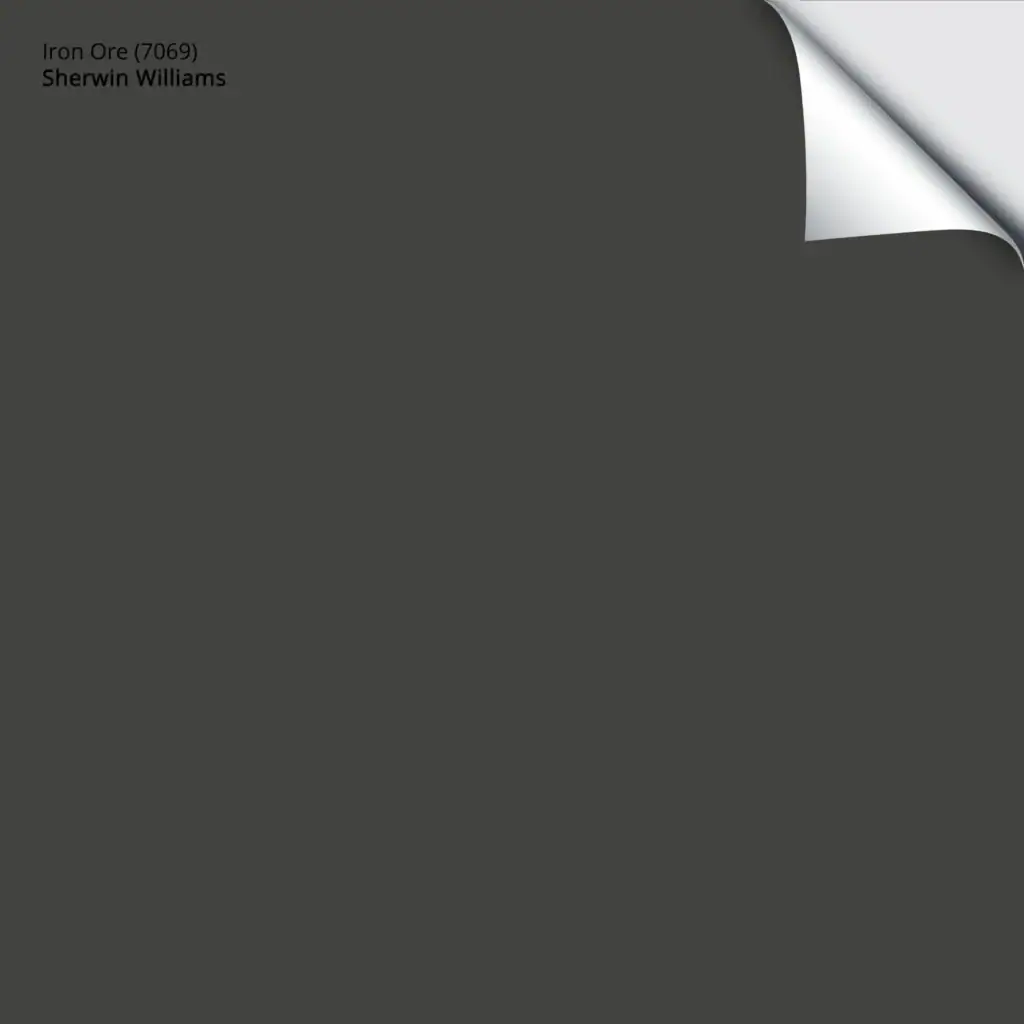
5. SHERWIN WILLIAMS IRON ORE 7069
It was a toss-up between Sherwin Williams Black Fox, Benjamin Moore Willow, and Iron Ore.
And while it KILLS me not to choose Black Fox or Willow, as I really wanted to…
Ultimately, I chose the color that still caters to yesterday’s black trends while winking at a softer look: Iron Ore. Black Fox put up a good argument – it’s a gorgeous dark gray and brown blend (with a tiny wink of green for good luck). And while I expect to see it on exteriors in the coming years, I don’t think it will have the popularity of Iron Ore.
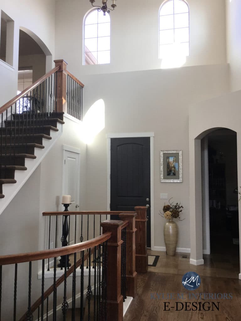
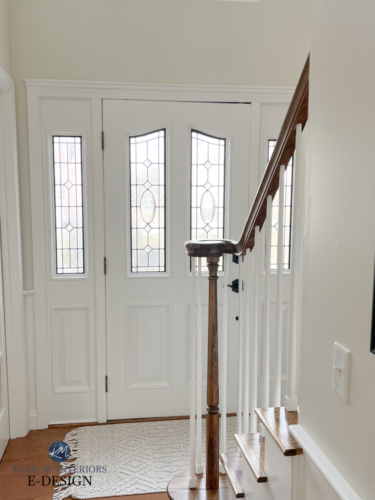
Sherwin Williams Black Fox door and Canvas Tan walls
As for Willow – be still my beating heart, I LOVE THIS COLOR. And it’s BROWN, people, and brown is definitely hot! However, people (on a larger scale) just aren’t leaning this way…yet. What I love about Willow is that it’s grounded by a gorgeous gray base, leaving you with a muted, passive warmth that’s great for exteriors, trims, and accent walls. However, it wasn’t my top choice for this range.
So, why Iron Ore?
While black is still reasonably popular as a hardware finish (but I notice that it’s fading when used on a large scale throughout a home), its popularity on cabinets and exteriors is waning, big time. Instead, many of my color clients are exploring shades of black, colors like Iron Ore.
Notice the contrast of Iron Ore with the black door hardware
Iron Ore is a soft shade of black. With an LRV of 6, it’s not as saturated as Sherwin Williams Tricorn Black (still hugely popular) but it isn’t light enough to be considered a dark gray or charcoal paint color. This softness has Iron Ore coming in hot for 2026, and I expect to see it on many surfaces.
WHERE DOES IRON ORE LOOK BEST?
- kitchen cabinets
- islands and bathroom vanities
- accent walls or entire rooms (I did this in my last home and LOVED it)
- front doors
- exterior siding, with a more legit black trim
- exterior trim
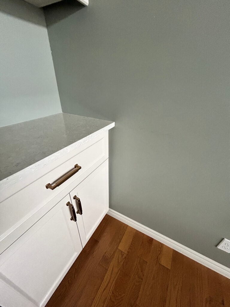
Fridge panels are yet to be installed, Iron Ore island. Compare it to the black outlet cover to see the contrast.
Get your PEEL & STICK SAMPLE OF IRON ORE
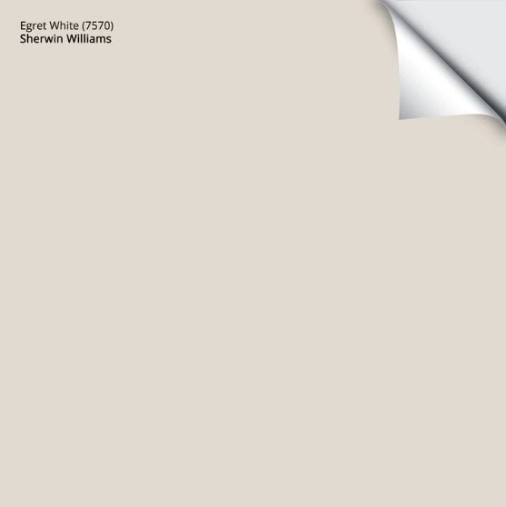
6. SHERWIN WILLIAMS EGRET WHITE 7570
Egret White is a warm, neutral paint color. Some see it as warm gray; others find its warmth more in line with taupe, which is its tendency. The best thing about Egret White is that, while many taupes lean hard toward violet-pink, Egret White (like Edgecomb Gray) has minimal undertone commitment.
Why Egret White?
Egret White is an awesome color as it’s transitional. Many homes struggle to shift out of the BEIGE world of the early 2000s, while others are buried in gray and looking to warm up their rooms. This is where Egret White comes in, bridging the hairy crack between the warm and cool worlds.
Sure, I see a lot of you leaning into the beige trend. But for those of you not quite there, Egret White could be the perfect happy medium.
WHERE DOES EGRET WHITE LOOK GOOD?
- in a single room, as it accommodates a wide range of adjoining colors
- open-concept spaces or even whole homes look great in a color like this
- for those who want an off-white exterior paint color with no strong yellow
- it’s an interesting cabinet color with the right countertop/backsplash
Get your PEEL & STICK SAMPLE OF EGRET WHITE
COLORS TO SAMPLE & COMPARE WITH EGRET WHITE
- Oh, you have to check out Sherwin Williams City Loft with a bit more color
- Sherwin Williams Modern Gray adds a bit more depth and coziness.
- Benjamin Moore Pale Oak is an awesome alternative to explore.
FULL Paint Color Review of Sherwin Williams Egret White
FAQS
You’ve got questions, I’ve got answers…
WILL THESE COLORS OF THE YEAR LOOK DATED IN A FEW YEARS?
In general, Colors of the Year aren’t in it for the long haul – they’re based on current and projected paint trends.
However, because I base my choices on the REAL WORLD, not high design, fashion, etc., my color choices often have greater longevity.
- Benjamin Moore Maritime White? It should look good for a long time compared to many colors (learn about timeless paint colors).
- Egret White could look a bit dated in a few years, but it depends on the home/lighting.
- Pale Oak – you should be able to get a few years, for sure.
- Pewter Green? Yeeeeah, probably, unless it’s your front door.
- Iron Ore? It depends on what it’s on.
- Balanced Beige? On cabinets, yeeeeah, you’ll want to be careful, same with whole homes. You should be pretty good in single rooms and exteriors.
WHY IS GREEN ALMOST ALWAYS A COLOR OF THE YEAR?
Regardless of paint color trends (re: temperature – beige, gray, etc), there always seems to be some shade of green that’s hot. While it varies from light to dark, warm to cool, saturated to muted, green is always in style – it just comes down to which TYPE is the most current.
SUMMARY
- Taupes and subtle beiges like Benjamin Moore Maritime White, Pale Oak, and Sherwin Williams Egret White are popular for rooms, open-concept spaces, and whole homes.
- While green cabinet trends have shifted toward softer, lighter tones, some still lean into colors like Pewter Green. It’s also good for accent walls, entire rooms, and doors.
- Stark black isn’t as popular as it was and has been replaced by colors like Sherwin Williams Iron Ore.
- Grounded, organic beiges like Sherwin Williams Balanced Beige are popular for rooms, open-concept spaces, whole homes, cabinets, and exteriors.
The Best WHOLE HOME Off-White Paint Colors
The Best WHOLE HOME Greige & Taupe Paint Colors
4 PART SERIES: How to Create a Timeless Home
Let me pick your colors for you with my ONLINE PAINT COLOR CONSULTING PACKAGES
Updated with fresh content, images, and colors for 2026
Hi Kylie, hired you last year for colors on our cabinets and trim. Still haven’t done anything yet but have been debating the Moderate White and Maritime you recommended. Funny enough, have jet black (you recommended if distressed with my new Venetian gold counters), Iron Ore and Black Fox samples on my wall for the lower cabinets. Started with urbane bronze but too gray. Do not like white or gray and plus like you said – have to do what the house wants and not me.
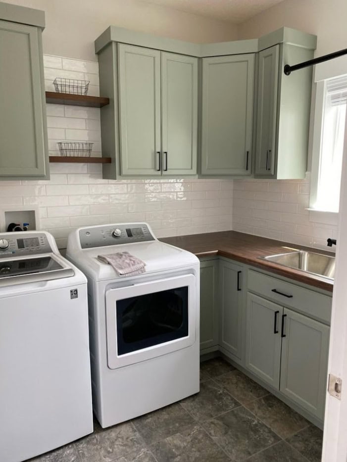
My question is – what color is on the upper cabinets in that kitchen with Iron Ore on the lower cabinets?
Many times, people will play with Maritime White or Moderate White, for example, using them regular strength on the walls, and 50% lighter on the cabinets and trim!
Hi Kylie. My living room is painted in Edgecomb Gray which I love! The room gets a decent amount of light. The problem is that it shares walls that lead into the foyer and up the staircase, which does not get alot of light. Can you recommend a coordinating color or should i try lightening Edgecomb Gray 25-50%.
Oooo, Edgecomb Gray looks SO gorgeous both 25% AND 50% lighter – definitely try it out. Otherwise, Sherwin Williams White Duck can be quite pretty with it 🙂
Hey I love your advice! I have a kitchen with proper grey cabinets and alabaster walls . Would color would match the rest of the walls of my house? Currently everything in my home is simply white by BM and the bedrooms are Sohji White. I’m looking to get away from the bright white .. thinking about the ERGET or Maritime?
But I have light natural floors and didn’t know if yellow undertones would wash it out?
Hey Michale, it’s SO HARD to say, as while you want to coordinate with the kitchen, it’s MORE important to work with the finishes in the rest of your home like carpet, tile, fireplace, furniture, and even consdier the exposures too! In general, you could check out SW Egret White and Edgecomb Gray which are quite flexible?
Hi Kylie, I was wondering if you could review BM 971 Olympic Mountains? I’m looking for a color for my entire downstairs. I currently have Revere Pewter and it’s just too dark. Edgecomb Gray seems too similar from the sample I put up. I don’t want white, just something brighter and more modern. Thanks!!
Hey Kimberly, Olympic Mountains is ALSO known as Fog Mist – and I have a review right HERE for you! https://staging2.kylieminteriors.ca/paint-color-review-benjamin-moore-gray-mist-fog-mist/
Love your site but the pop up ads have got to go….just too hard to read popping up and trying to click off.
Good color reviews etc but just my 2cents!
Ugggh, I know. It’s so hard. The ads earn income for me, but at some point they can be TOO much, I totally get it. I’m going to talk to the hubs about how many pop up and if we can cut that back a bit 🙂
I love Maritime White! Painted my living room/dining room/stairwell with it in 2017. I tried dozens of off-white samples before I landed on it.
I can’t see any of the photos in your post though..? Not sure why.
Hmmm, well THAT’S weird! I wonder if it’s a security thing on your end as I haven’t had anyone else say anything – I’ll double-check though!
Yes I had same issue until I checked security box on my end that said I was human. lol
Good morning,
I love your color information. Quick question – how does Egret White compare to Aesthetic White? We have used Aesthetic White and loved it, but are now looking for paint for a different home and Egret White looks very appealing!
GREAT choices, I love these two. First, Egret White has an LRV of 70 to Aesthetic White’s 73, so it’s a bit darker and shows that bit more contrast with trim. Next, it’s also a bit grayer, and rather than having Aesthetic White’s subtle beige (orange) hue, it has a subtle violet-pink undertone. And when I say subtle, I mean REALLY subtle, as it’s one of the few taupes/warm grays with minimal noticeable undertone!
Thank you! I’m redoing a bathroom and had already settled on egret white with iron ore vanity. Looks like I’m trending and didn’t even know it. haha I’m just hoping that matches my greige, taupe, gray countertop! the tile designer said I need to paint the vanity with one of the black specks in the granite. That’s either black fox or tricorn black. I don’t what either of those as that seems too dark.
You’ve been so helpful over the years. My last house was Edgecomb gray years ago and loved it! Seems that color is never going to go out of style.
Hi Kylie!
My entire kitchen & living room are Pewter Green as well as my husband’s office/podcast studio. Would be happy to send some photos!
Is there an email I should use?
Love, love, love your blog and all the beautiful inspo photos and tips 🤍
YESSSSS, I would so love to see it! My email is kylie@kylieminteriors.ca – THANK YOU!!!!
Hi! I was leaning toward Van Deusen Blue for a couple spaces… Office with tons of natural light and my son’s bedroom as an accent wall with Gray Owl (he’d love his whole room to be dark blue). You’ve got me thinking about Britannia Blue now! So pretty!
Oooo, it is darn pretty!!!
I thought Maritime White sounded perfect based on this review, but in our house it looks too washed out. 😢 Suggestions for similar but more oomph? Carpet is grey with pink-purple undertones.
Awwww, how about something like SW Popular Gray (more taupe), BM Cedar Key, BM Muslin?
Those all look nice. We are leaning towards Muslin. Any thought on Muslin vs White Sand? Thanks for your reply.
Hi Kylie, thinking of Britannia Blue for my built ins and a powder room accent wall. Will this colour look good with Collingwood
Oh, HECK YES!
I’m doing my kids bathroom that has no windows in egret white and was thinking about painting the vanity Mountain Road by SW. thoughts? I’m having my the toughest time. Also tile and counter top is gray tones
I have NO problem with this combo, as long as you think it s uits your tile and countertop!
Thoughts on Pewter Green as an exterior color? We’re doing that with Black Fox trim. Debating mahogany garage door/front door or walnut. We’ll have light stone across much of the front of the house to lighten it up as well.