
Sherwin Williams Repose Gray is a light, warm gray paint color. It works well on interior walls, especially open-concept spaces and bedrooms, as well as cabinets.
Repose Gray’s undertones and overall appearance can change depending on a room’s exposure, light bulbs, and surrounding finishes.
Now, are you feeling nervous about gray’s sneaky green, blue, and purple undertones? You should be, as Repose Gray has a lot up its sleeve. Today, I’m on a mission to demystify Repose Gray and see if it will work for you.

WHAT KIND OF GRAY IS REPOSE GRAY? WARM OR COOL?
Repose Gray is a gray paint color (I’m not just good-looking, you know). However, it’s not a true neutral gray; it has a wee bit of brown in it, making it a warm gray. This bit of warmth doesn’t make Repose Gray close to beige but puts it a step away from traditional shades of stormy or cool gray like Sherwin Williams Big Chill and Light French Gray.
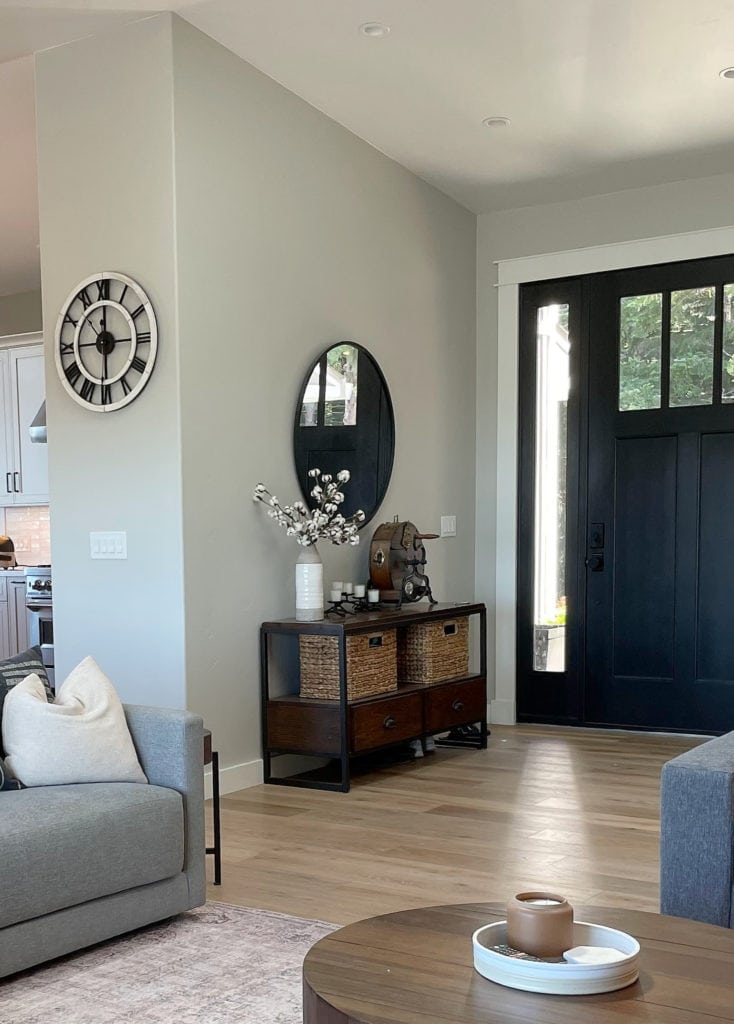
This next photo is as awarm as I’ve ever seen Repose Gray look. Usually, it caters harder to gray…
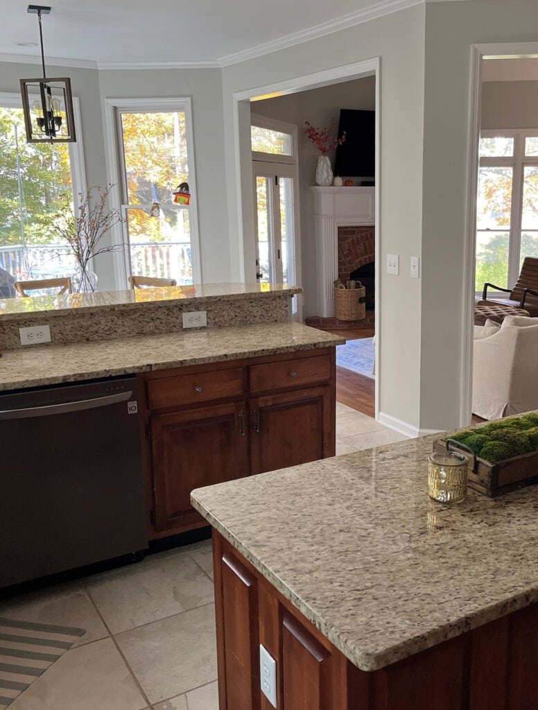
How to Update Your Outdated Granite Countertops – Venetian Gold/Santa Cecilia
WHAT ARE REPOSE GRAY’S UNDERTONES?
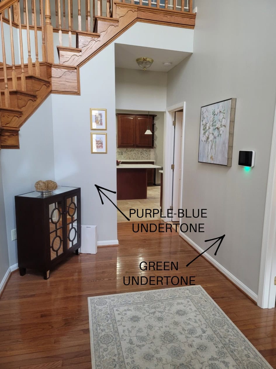
While Repose Gray can favor a soft violet undertone, it also has a bit of a green undertone. And believe it or not, once in a while (given the right exposure/interior finishes), I’ve seen Repose Gray flash a touch blue.
While every gray has undertones, some grays flex a bit more, and Repose Gray is definitely one of these grays, which makes it a complete bugger to rely on. Because Repose Gray can be unpredictable, I highly recommend ordering the Samplize version to see how it settles in YOUR room.
By the way, my blog runs 99% on wine, Doritos, and my Online Color Consulting clients’ and readers’ photos—thank you so much for sending them in!
Now let’s hit a few specific questions that often come up when talking about Repose Gray and undertones…
WILL REPOSE GRAY LOOK OVERLY BLUE?
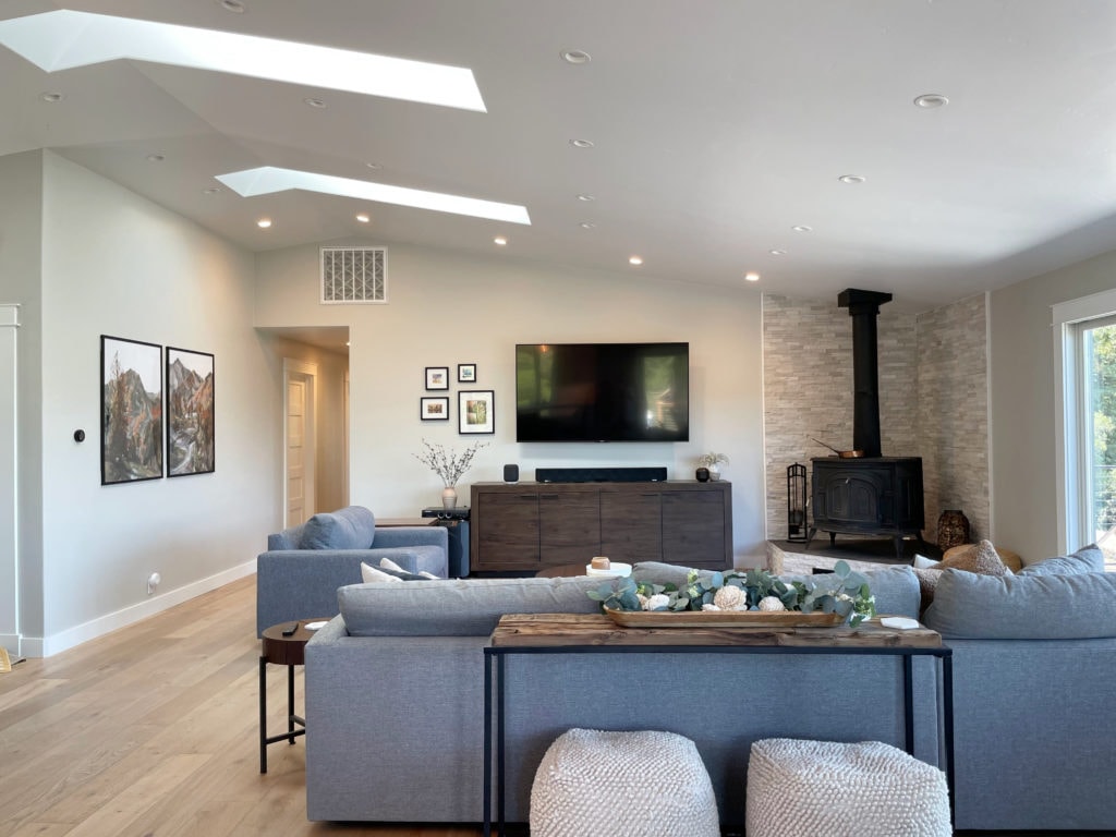
While Repose Gray doesn’t want to look blue in the right environment (i.e., exposure-based or with trim that’s overly warm), it CAN pick up a blue hue. However, of the three gray undertones, blue is the least likely to show up, as shown in this next photo (hardly a wink of blue to be seen).
WILL REPOSE GRAY LOOK OVERLY GREEN?
Repose Gray can nod politely at green but rarely commits on a large scale. If you’re sensitive to green, it shouldn’t set off any alarm bells, but sample carefully. If you place Repose Gray with a finish that has a purple undertone, it could seem a touch green in comparison.
This next photo shows Repose Gray picking up a subtle green hue…
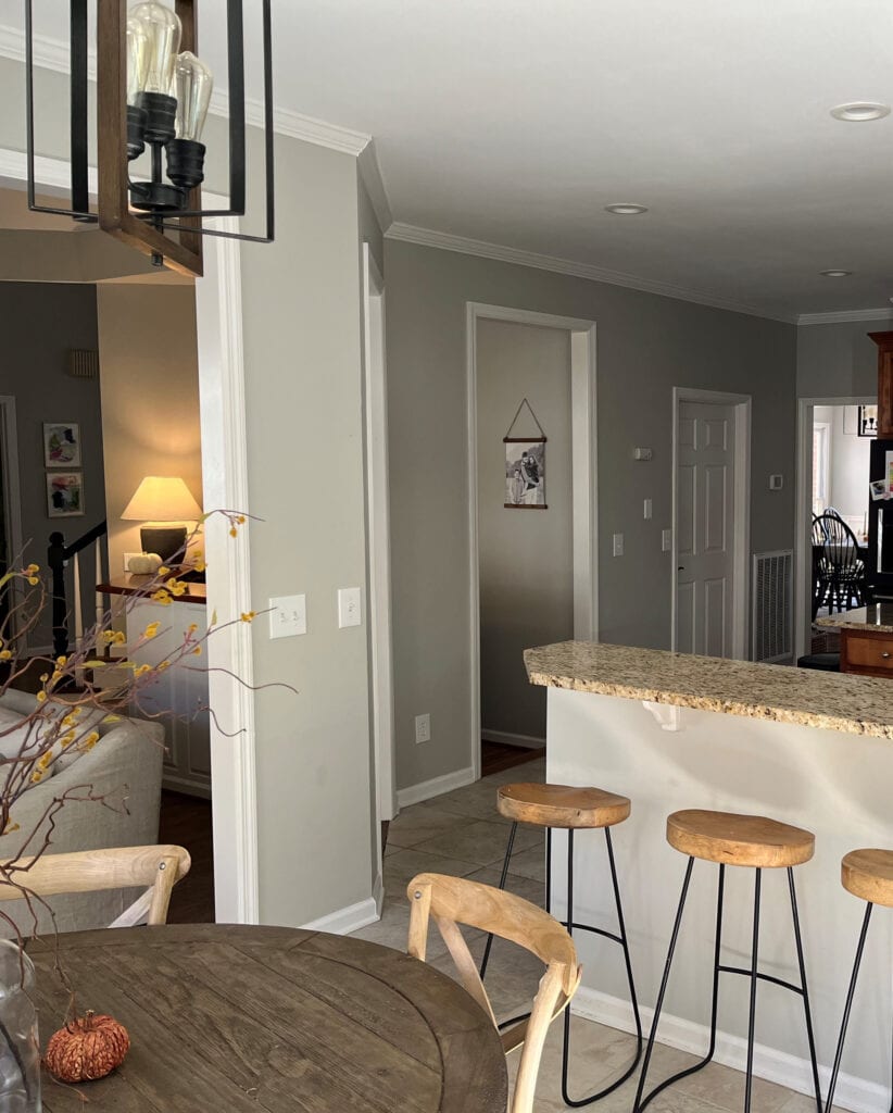
However, as shown earlier, notice how Repose Gray’s undertones shift depending on which part of the room you’re looking at, the time of day, and the light bulb temperature…
If ANY degree of green makes you nervous, you may want to read this…
The Best Gray Paint Colors With VIOLET/Purple Undertones
WILL REPOSE GRAY LOOK OVERLY PURPLE?
Just as with the green undertone, Repose Gray can pick up a touch of purple without hardcore commitment. If you don’t want any chance of violet – you’re looking at the wrong color. Instead, explore shades of gray that are more inclined towards green.
Remember, EVERY gray has undertones – find the one that best suits the finishes in your home!
As for blue undertones, while it can grab some blue, the undertone in this next image is the exception, not the rule, when it comes to Repose Gray…
This isn’t common, but you still have to be careful! Ideas to Update Your 1990s Home
Long story…long, Repose Gray is a sneaky little bugger.
WHAT’S REPOSE GRAY’S LRV?
Repose Gray has an LRV of 60. With an LRV of 60, it won’t look like a heavy color in a room with an adequate amount of light, but it also won’t bring a ton of reflective value to the table (or the wall, in this case) if you have a darker room. Also, with its particular warmth and undertones, it can look a bit drab and dirty in low-light spaces, which we’ll look at next.
The Ultimate Guide to Choosing Paint Color with LRV
REPOSE GRAY IN A LOW-LIGHT/DARK ROOM (OR COOL EXPOSURE)
A room might have low or cool-toned natural light for a few reasons:
- it’s north-facing
- it has east-facing afternoon light or west-facing morning light
- there are a lot of trees outside blocking the sky
- it doesn’t have many windows (or any windows)
- there’s a large overhang outside the window (like a deck or large soffits)
Any of the above reasons will contribute to Repose Gray’s changing overall appearance, flexing through the cool undertones and going from a warm gray to a slightly cooler-looking one.
SAMPLE AND COMPARE SIMILAR SHADES—make sure Repose Gray looks like you want it to in your space!
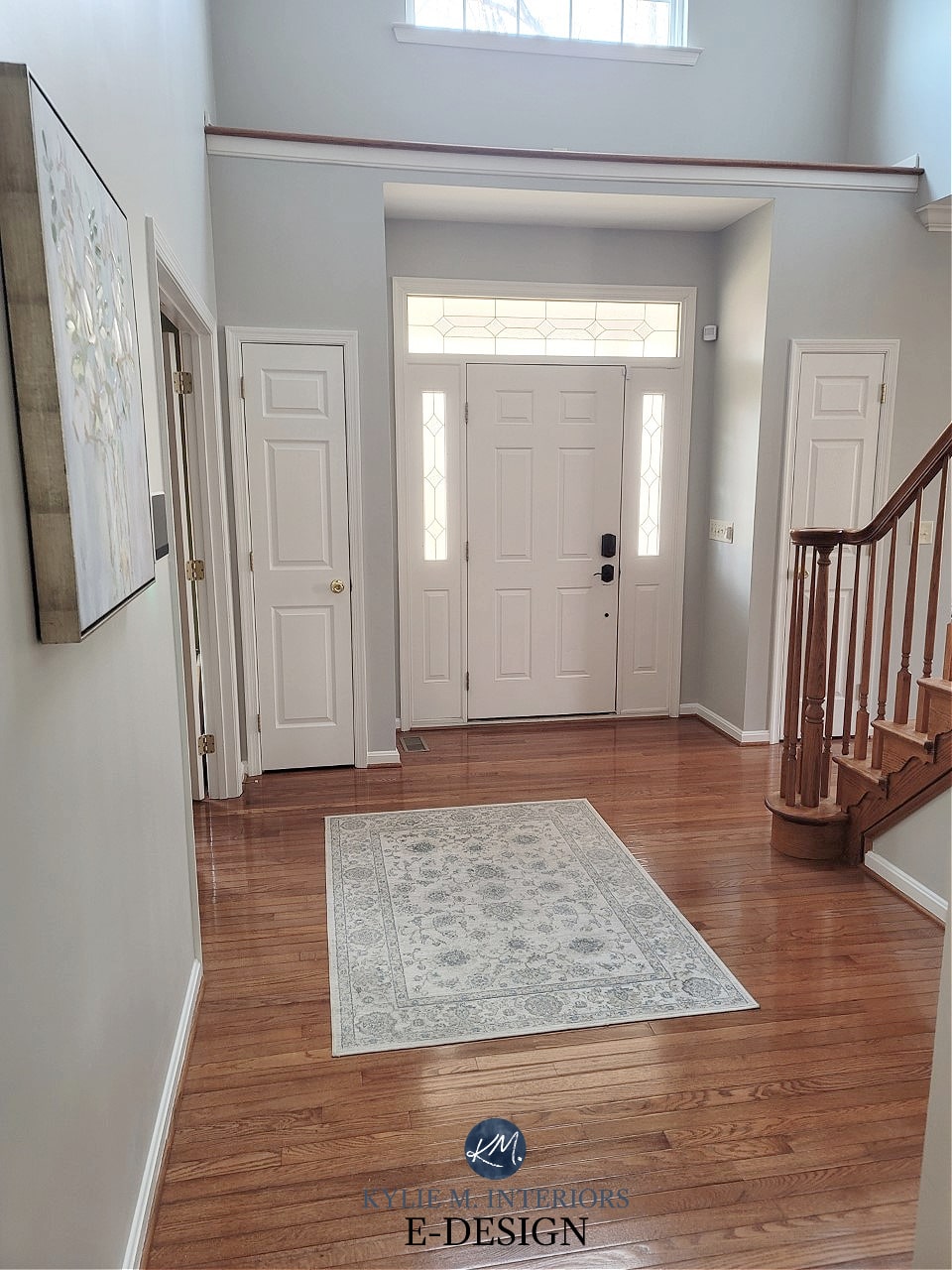
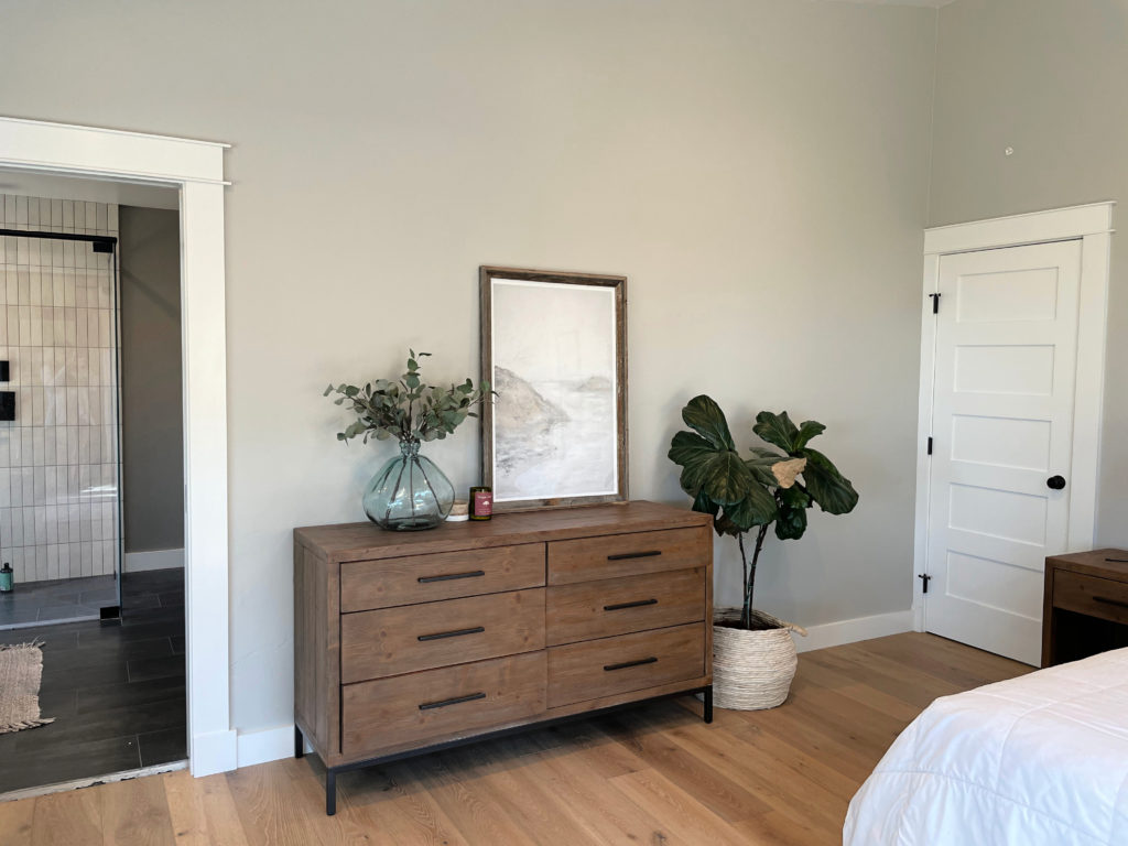
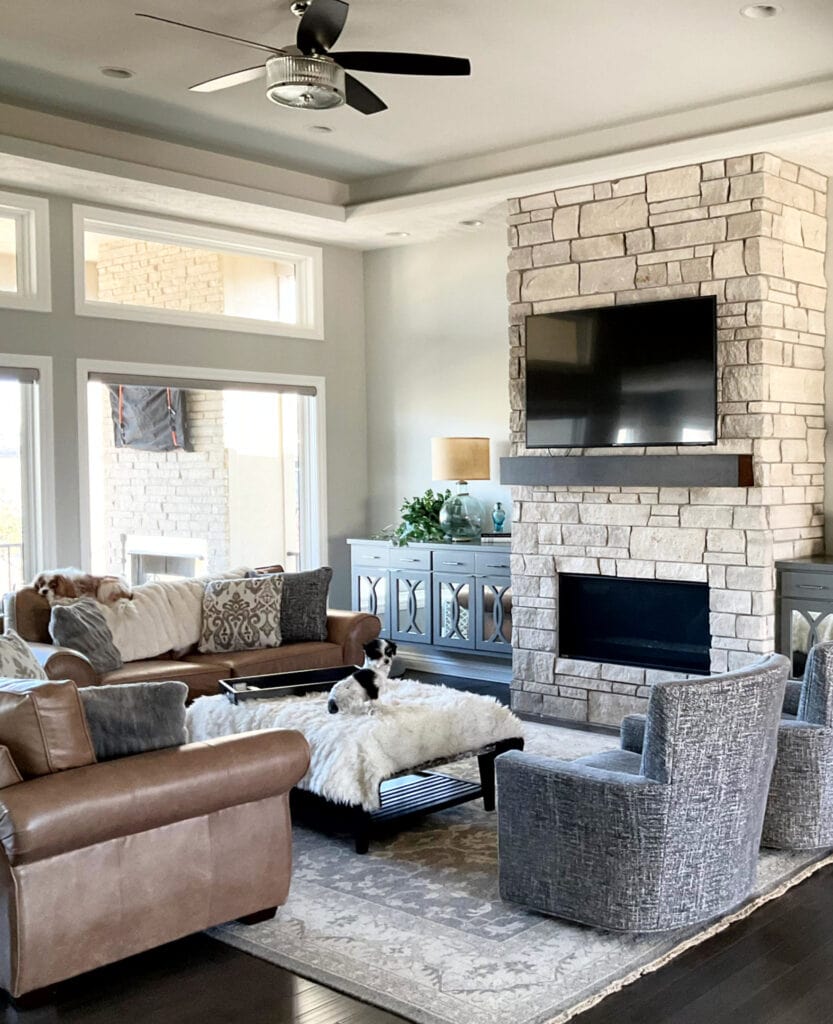
In this next image, Repose Gray is at its best. The room isn’t so bright that the color washes out or so dark that it looks drab, although that could be open to perception, especially if you want a cleaner, cooler shade of gray.
If you have a darker room, Repose Gray can look heavy and drab due to the color itself…
1. Repose Gray lacks much chroma or ‘color’. Color is often used to add interest and personality to a room with muted light.
2. Repose Gray has a slightly lower-than-average LRV (as discussed earlier). That low LRV, combined with the low chroma, can leave it pretty flat-looking. You need to improve your interior lighting and choose the right light bulbs to bring it to life!
REPOSE GRAY IN A BRIGHT ROOM
Because Repose Gray has an LRV of 60, it will still wash out a bit in an ULTRA-bright room but will hold itself better than many of the lighter gray paint colors.
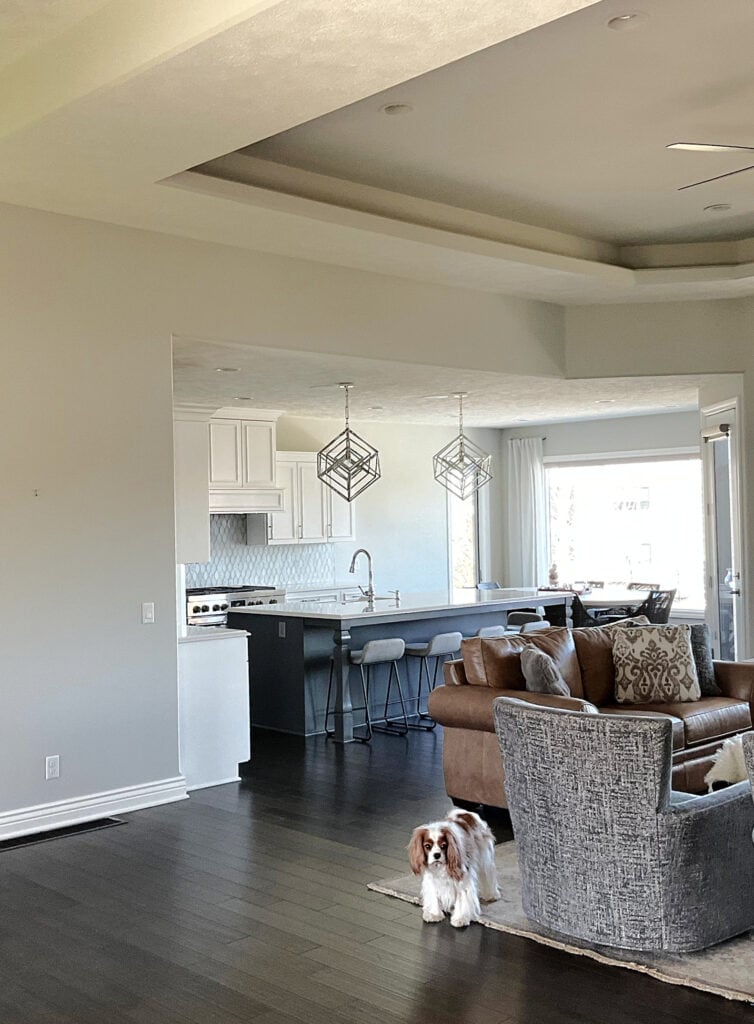
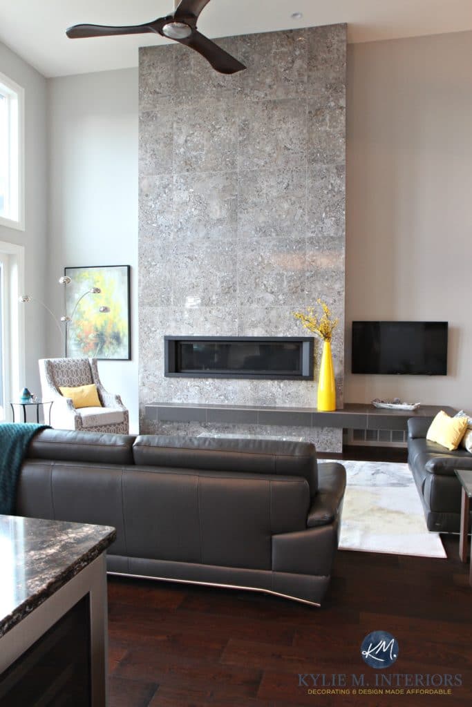
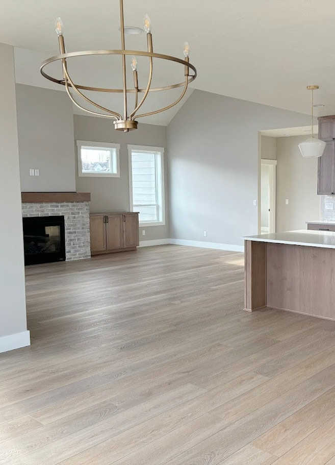
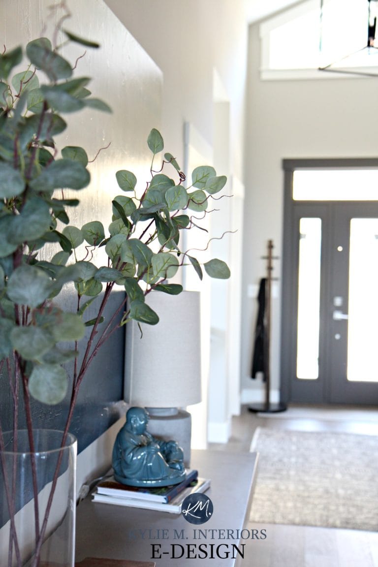
In this next photo, you can see a dramatic shift from the left side of the fireplace to the right (okay, I may be exaggerating). Notice how the depth and undertones change with the shift in natural light (the left side is bright northern light).
Paint sampling just got a whole lot easier!
Get your Peel & Stick sample of Repose Gray
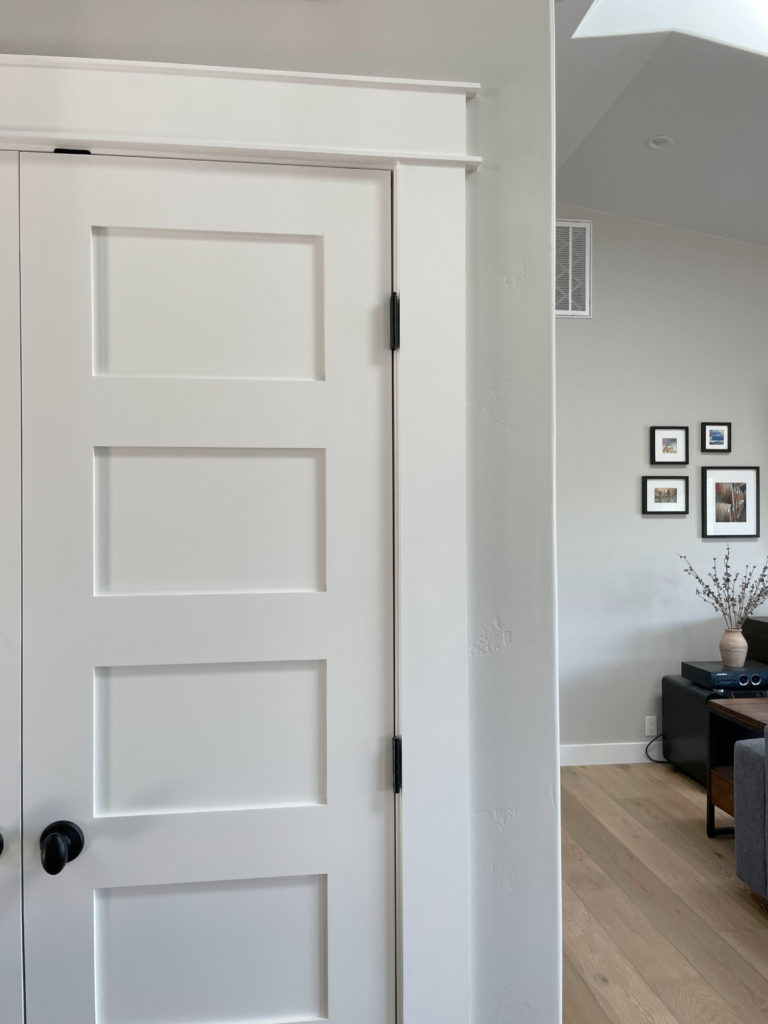
WHAT WHITE TRIM GOES WITH REPOSE GRAY WALLS?
When looking for a white paint color for trim, cabinets, ceilings or doors, lean into those that aren’t OVERLY warm, for example…
- Sherwin Williams Pure White with its wink of softness
- Sherwin Williams High Reflective White for a cleaner approach
- Repose Gray does NOT want to be partnered up with an overly warm white!
Sherwin Williams 4 Best White Paint Colors
WHAT ABOUT WALL COLORS WITH REPOSE GRAY CABINETS?
On the other hand, thanks to the gray trends of 2010-2020, many have Repose Gray cabinets. It’s TOUGH to change wall colors when you have a color in this range, regardless of whether it’s gray, beige, taupe or otherwise.
It’s ideal if you have 15-20+ (20+ being ideal) LRV points between your Repose Gray cabinets and your walls, meaning your walls will have an LRV of approximately 75-80+. Tread carefully, as Repose Gray is DAMN FUSSY. If you ask me (which you kind of are), your best bet is white.
The Best White Paint Colors to Go With Gray Floors, Countertops, Etc.
WHICH PAINT COLOR IS SIMILAR TO OR MATCHES REPOSE GRAY?
There will be no perfect match when it comes to different brands – each color will have its nuances, undertones and intentions. This is even more the case with Repose Gray, as Benjamin Moore doesn’t have anything even close. However, these colors have similar intentions…
- Benjamin Moore Nimbus
- Benjamin Moore Cumulus Cloud (much warmer)
- also, check out Sherwin Williams On the Rocks and Knitting Needles for a slightly different look
And if you’re thinking of color matching between brands, you might want to read THIS first.
Sherwin Williams Agreeable Gray vs Repose Gray, Revere Pewter & More
My FULL Paint Color Review of Sherwin Williams Knitting Needles
WHAT PAINT COLORS GO WITH REPOSE GRAY?
If you’re looking for colors that compliment Repose Gray in a room-to-room palette, check out…
- whites that are bright or only slightly warmer (i.e. Sherwin Williams Pure White)
- shades of gray with similar undertone profiles but more DEPTH, like Dorian Gray or Dovetail
- GRAY-blue-green blends, especially those in the light-medium or medium range (i.e. Sherwin Williams Argos is awesome)
- slightly darker BLUE-GREEN-gray blends (meaning the gray takes a step back).
- DARK blue-gray blends can be magical with Repose Gray.
- Dark green-grays like Sherwin Williams Grizzle Gray, as well as a wide range of medium to dark green paint colors.
- Repose Gray doesn’t always like paint colors that are cooler and lighter than itself OR darker and warmer
FUN FACTS ABOUT REPOSE GRAY
- Repose Gray is not a typical ‘fresh’ gray; it’s soft and warm, even though it can look cooler in some situations.
- Of the warm gray paint colors, Repose Gray is one of my least favorites as it’s more unpredictable than my time of the month (thank you, menopause).
- If you don’t like purple undertones, you’ll want to tread carefully with this color. That being said, I have many Online Color Consulting clients who don’t like purple undertones who LOVE Repose Gray. The same goes for green!
- Repose Gray was super popular about five years ago, and I hardly hear about it now.
Finally, let’s cover a few common questions with…
PEOPLE ALSO ASK THIS ABOUT REPOSE GRAY…
IS REPOSE GRAY STILL A POPULAR PAINT COLOR – IS IT OUTDATED?
While Repose Gray has a small following, with trends leaning warmer, it’s not popping up nearly as much. The facts are, there are other warm neutrals with more predictability and flexibility.
IS REPOSE GRAY BETTER THAN AGREEABLE GRAY?
A question like this is ALWAYS open to perception. However, in my Color Consulting, Agreeable Gray is 100 times more popular than Repose Gray and is often the better choice for the average room, not just for its warmth, but for its slightly lighter depth.
My FULL Paint Color Review of Sherwin Williams Agreeable Gray
DOES REPOSE GRAY GO WITH EVERYTHING?
Heck…no. While Repose Gray can be reasonably flexible, it’s often a bit too cool for interior finishes and rooms with ‘less than ideal’ lighting.
Not sure if Repose Gray is the right color for you? I’ve got more!
READ MORE
The Top 10 Warm Gray Paint Colors
The 12 Best WHOLE HOME Gray & Greige Paint Colors
Paint Color Review of Sherwin Williams Colonnade Gray
Sherwin Williams Agreeable Gray Paint Color Review
Paint Color Review of Sherwin Williams Light French Gray
NEED HELP?
Check out my Online Consulting / E-Design Services!

Written in August 2015, updated in 2024
I just rented an apartment painted entirely in Repose Gray. I hate it. Not the color itself, but the fact that it doesn’t go with any of my furniture or rugs. Anything warm like tans with yellow in them look repulsive with the paint. If you have clear colors like greens or blues (I have both), forget it. The other thing I’d say about it is that it is best to use in a transitional or contemporary design. It makes good wood look really drab. Unfortunately, house flippers are still obsessed with using this color, so you see it everywhere. It is, in my opinion, by NO means a neutral go-with-anything color. Annnnd . . . remember the effect color has on mood. Gray mixed with brown, people.
Oooo yes, Repose Gray is a TOUGH one. I’ve actually seen it fall out of favor quite a bit in the last few years! Thank you for your comment as it helps others make the best choice for THEIR homes!
Our whole house color is Repose Gray and it’s perfect to add a touch of warmth to our old home (1928). However, I’m struggling to find a coordinating color for our east facing bathroom that butts up against the repose gray hallway. I’ve tried sea salt and it’s too “seafoamy/minty” looking. Healing aloe is looking too minty as well. Do you have any east facing paint color recommendations that coordinate with Repose gray? I haev a small red persian area rug and white tile currently. Thank you!! I’m stuck!
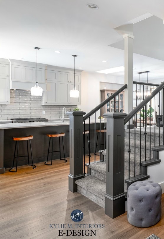
Oh, it’s SO hard to say without seeing the room, but have you checked out the likes of SW Silver Strand???
Hi Kylie, Love your blog and your sense of humor. I am perplexed!! I think I have every paint swatch that BM and SW makes in the grey family. My kitchen is small, western light. I want to paint the cabinets a light grey. My walls are White Dove, which looks very bright. My floors are off white tile which has a bit cream and grey but look light. My quartz is grey and black veining with gold veining on a light background.. I thought White Dove for cabinets or Agreeable Grey, or Repose grey. I want a slight difference from the walls. Any thoughts? Also I thought the quartz would favor a slightly darker cabinet!
Ooo, it’s tough Karen, as White Dove can be a bit FUSSY about its cabinet partners! I wouldn’t do Repose Gray, and with Agreeable Gray, I might just bump down to the light-medium version, Anew Gray. It can also really depend on the undertones in the gray in your space, whether they cater to blue, violet, or green. I do know that REvere Pewter 25% darker looks LOVELY with White Dove (as i have this combo in my home!).
Thanks Kylie…. I just found Crushed Ice while looking for soft grey colors. I was thinking crushed ice on cabinets and white dove on walls. Would they complement each other? Thanks for answering!! 😄
I miiiight just darken Crushed Ice by 25% or lighten White Dove by 25%. Or maybe just look at Pure White instead of White Dove 🙂
Can’t crushed ice pull purple?
It certainly can, given the right lighting conditions! Some grays are more susceptible to movement than others, and Crushed Ice is one of those.
Hi Kylie,
Trying to decide what cabinet color to go with for my west facing kitchen with a lot of light, I lightened repose grey 75% and I also lightened it 50%. I really would like a similar color that is in between. Any recommendations? Also, if I do go witht the 50% lightened repose on cabinets, which trim color would you suggest?
My kitchen inspirations is this: (please note she has repose grey on her cabinets but her photos are lightened and not a true respresentation of the color).
https://www.findinglovely.com/our-kitchen-reveal-finally/
Thank you!
Oooo, that is lovely! Now, it’s hard to say what look you’re going for, as you’re right, Repose Gray can look much different from that. This said, it looks like you’re trying to get that GENERAL look by lightening Repose Gray these percentages?
Either way, it’s tough for me to say for sure without seeing the lightened samples against white. For a color in between, every color will have its nuances and shifts. Off the VERY TOP of my head, the color on those cabinets looks like a light, stormy gray (not warm, not cold) with violet undertones. This would have me naturally thinking of BM Silver Satin. Generally, the lighter you go, the more that purple can pop up, so you do need to be careful (i.e. SW Eider White can be quite violet). And while it might be a bit warmer than you’re wanting, those cabinets have me thinking of BM Light Pewter, too!
Hi Kylie,
I recently selected SW Repose Grey for an over all house paint, Starting in the hallway with no natural light, however, it is revealing more of a purplish undertone than all my swatches I did showed (This is also my first house DIY Remodel). The house has the old 70s style red/orange wood floors, not sure the stain color but it looks similar to Brazilian Cherry according to pictures. And then a creamier off white trim. Before I repaint my whole house, should I switch my paint? I am looking for a light greige color that goes well with an older limited lighting house to brighten everything as it is so gloomy and dull with the DARK beige walls. I am also not against repainting my trim if that would help. I also have two built in wooden bookshelves I want an accent color to paint that gives a modern, yet minimalistic/rustic vibe. Please help, im struggling
Oooo, it’s so hard to say without seeing your home, but off the TOP, I’m not a huge Repose Gray fan, in general. If you’re open to changing the trim, maybe something like SW Egret White or BM Edgecomb Gray might be more moderate??? SW White Duck is lovely, too.