
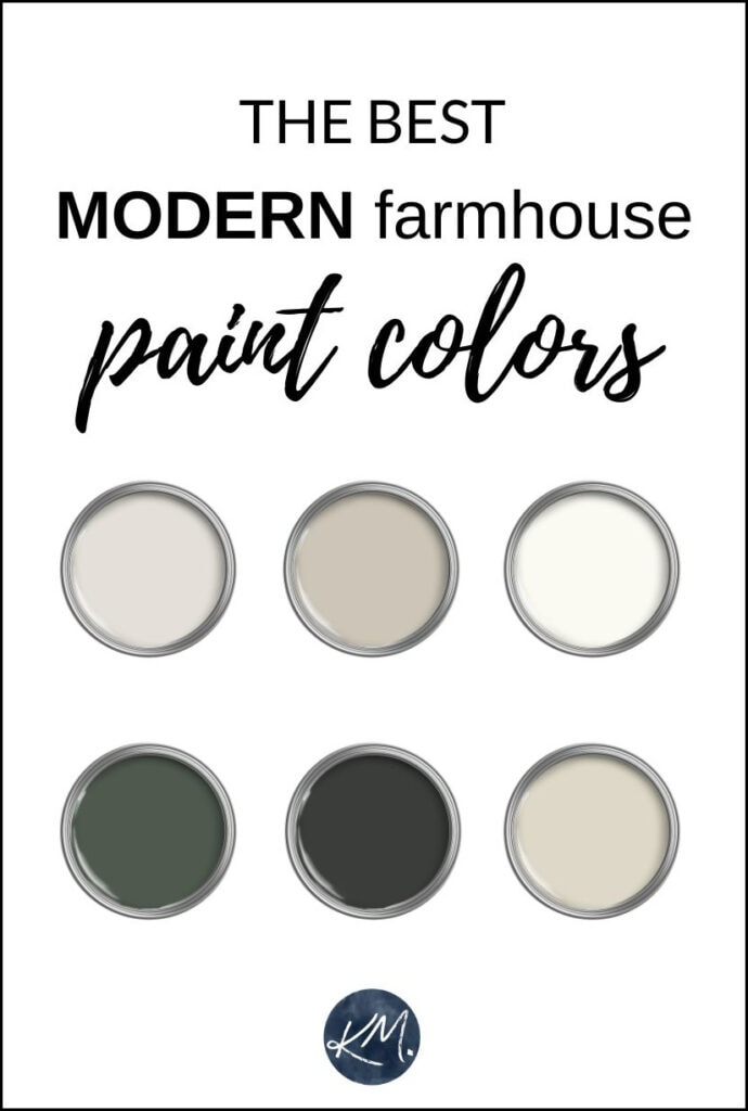
Farmhouse-inspired shades for rooms, cabinets, & more
Modern Farmhouse style has been kickin’ it for years. With curated color palettes, lived-in looks, and cozy comfort, there’s a lot to love. However, styles and tastes have evolved, and Modern Farmhouse has shifted gears.
IS MODERN FARMHOUSE IN STYLE FOR 2026?
Whether you’re painting walls, furniture, or cabinets, the modern farmhouse look is still reasonably popular. But is it TRENDY? No. While some still embrace the visual interest of a shiplap wall or overly distressed, painted furniture, the more modern approach to modern farmhouses is less inclined.
In fact, it’s hard to put a finger on the style that’s replacing Modern Farmhouse.
It’s more like the definition of ‘Modern Farmhouse’ is changing—it’s leaning more toward the modern and less toward the farmhouse.
PREVIOUS MODERN FARMHOUSE TRENDS
Two main farmhouse-inspired trends dominated the last 10 years or so.
FARMHOUSE STYLE: PHASE 1
About 10-15 years ago, the farmhouse trend was a bit more rustic. This is where we saw a lot of super rustic, hand-painted furniture (often Annie Sloan Chalk Paint). As for room colors, shades like Benjamin Moore Palladian Blue, Windham Cream, and Guilford Green were popular. (and still have a following).
FARMHOUSE STYLE: PHASE 2
This trend shifted to a brighter, cleaner approach to the farmhouse style – one might call it…Modern Farmhouse. This is where we saw tons of white walls, rustic wood, shiplap, navy blue islands, and white oak flooring.
And while some are still participating in the above, TODAY’S Modern Farmhouse colors have a different approach.
But what are modern farmhouse paint colors?
Generally speaking, they’re colors that give the illusion they’ve been ‘lived in for a while‘. Not the‘kids’ fingerprints plastered up your stairwell’ lived-in, but rather the slightly worn look that gives a sense of history to a room.
Today’s Modern Farmhouse-inspired home has a slightly cleaner, natural vibe.
MODERN FARMHOUSE PHASE 3
You might even call this latest farmhouse-inspired update ‘Transitional Modern Farmhouse Style’. The ‘transitional’ part tells us that some of the colors and finishes are less committed to country and more flexible.
Today’s updated modern farmhouse palette is dominated by dirtier, calmer, neutral shades, including:
- muted mushroom paint colors
- stormy shades of dark green
- subtle and warm off-whites
- burgundy and oxblood
- rich sable browns
- a range of beige and tan paint colors
- greiges and taupes
Of course, this doesn’t mean you have to adopt this newer approach—you can do whatever suits your little old self. But if you’re looking to shift the look of your home, I’ve got some great colors for you.
While the modern farmhouse look has other elements (texture, wood tones, etc.), I’ll focus on paint color ideas for your rooms and cabinets—some real inspirations to get you in the country mood, short of strappin’ on some buttless chaps.
1. SHERWIN WILLIAMS ALABASTER 7008
Surprise, surprise…WHITE! There are many good reasons why this particular warm shade of white is still kickin’ it. But most importantly, Alabaster isn’t a stark, bright white—it’s soft. Previous trends had us leaning into any ole white and slapping it on all paintable surfaces.
While Alabaster is a creamy shade of white, it’s not as yellow as some, offering a more subtle approach to cream. I’m pumped that color trends are softening, as warmer shades like Alabaster and Benjamin Moore’s White Dove are taking over and getting more wall time.
Paint Color Review of Sherwin Williams Alabaster
With an LRV of 82, Alabaster hugs ample bosom between off-white and white, making it pretty darn versatile.
As for White Dove (my one true love, other than Tim), it’s a bit whiter/brighter than Alabaster, but offers the same pretty softness (just with a bit less yellow cream). While some find it a touch grayish, it comes down to what you’re looking for in a white – bright, creamier/yellow, muted, or cool.
Paint Color Review of Benjamin Moore’s White Dove
Sure, some are leaning into even softer, creamy paint colors; SW Alabaster and BM White Dove are great transitional shades for a modern farmhouse home.
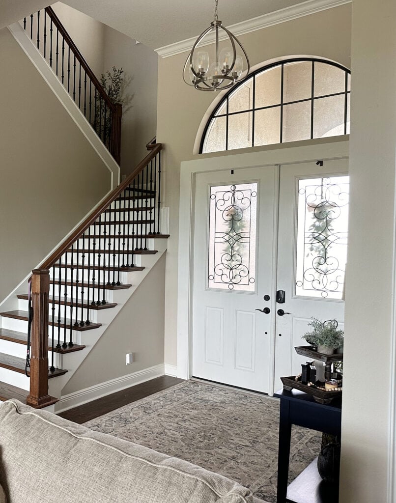
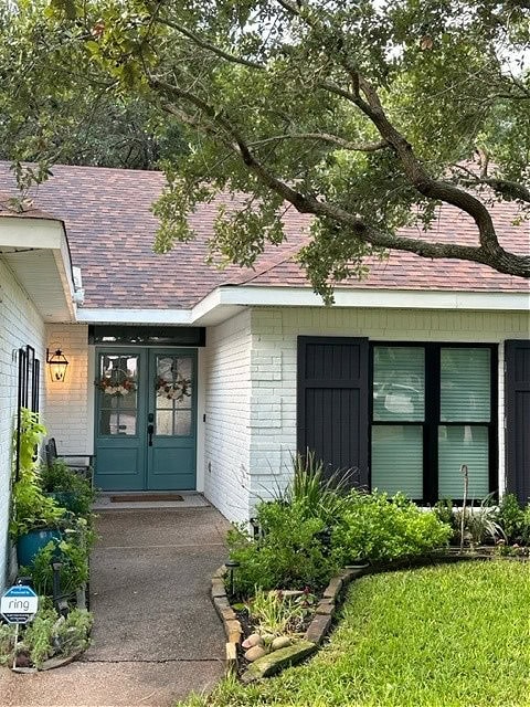
Sherwin Williams Accessible Beige walls with Alabaster trims and front door
2. SHERWIN WILLIAMS AESTHETIC WHITE 7035
While not everyone is ready for real beige (although many are), tons of my Online Color Consulting clients have fallen head over bootstraps for muted, trendy shades. Aesthetic White is one of the more popular warm neutrals. While it has a beige look, it’s tempered by a big whack of gray, calming its warmth.
Like Frank’s Hot Sauce, you can ‘put this $@%! on anything‘ – meaning Aesthetic White is so popular that many people paint their walls, trims, and ceilings the same color, also known as color-drenching or color-washing. While I’d be careful with this trend (as you’ll likely want to repaint your doors and trims white one day), it’s a pretty look if you’re so inclined.
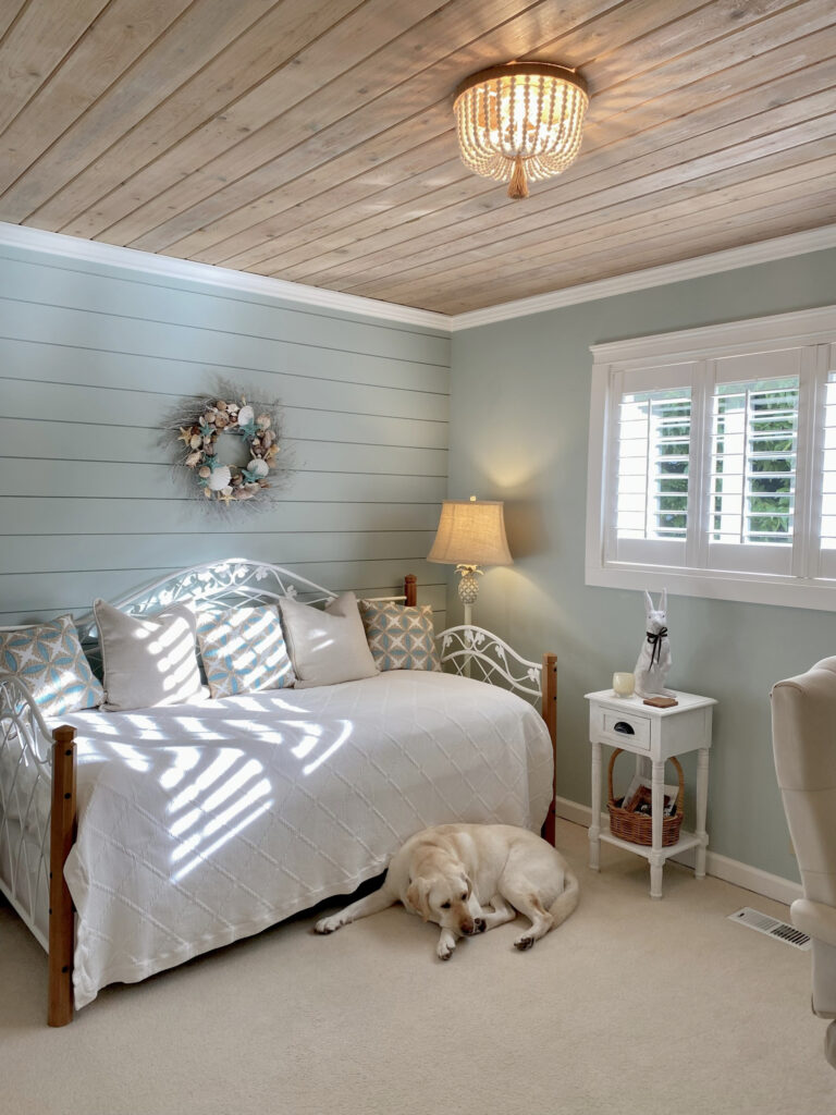
I chose Aesthetic White for the bedroom and bathroom at our lake home. While I was super tempted to toss it on every paintable surface, I knew I’d get tired of the look, and that white is a more timeless approach.
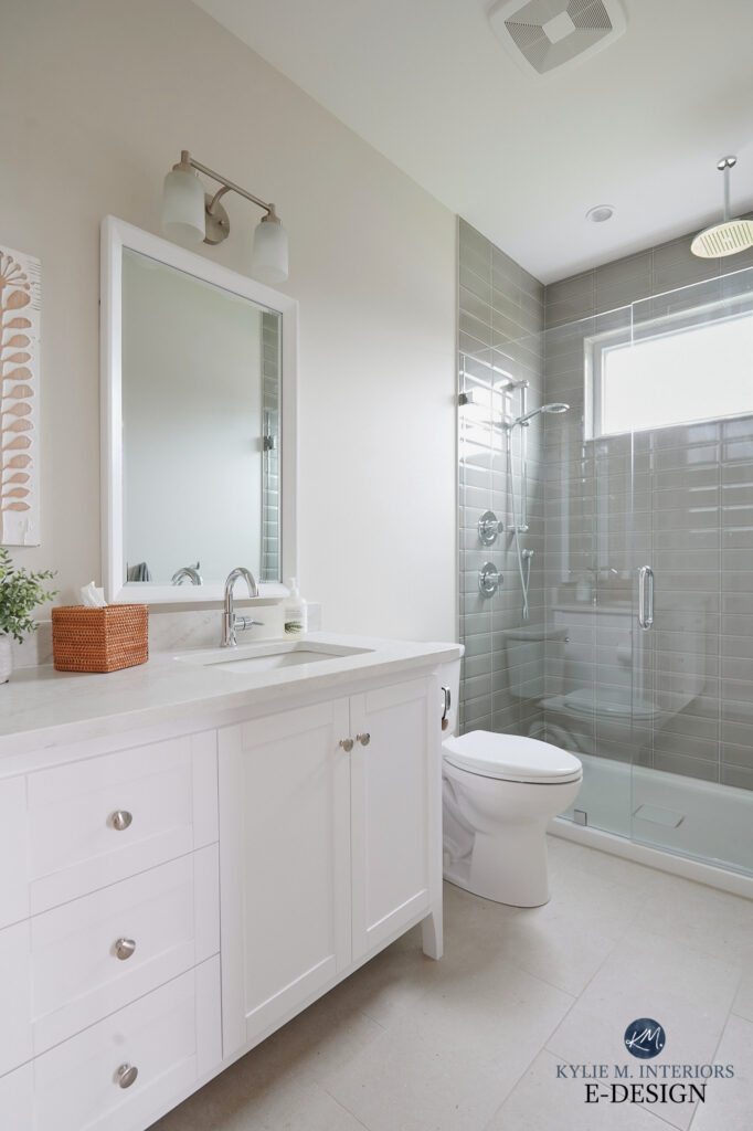
Here’s Aesthetic White in our bedroom (showing Aesthetic White on a south-facing but cloudy day)…
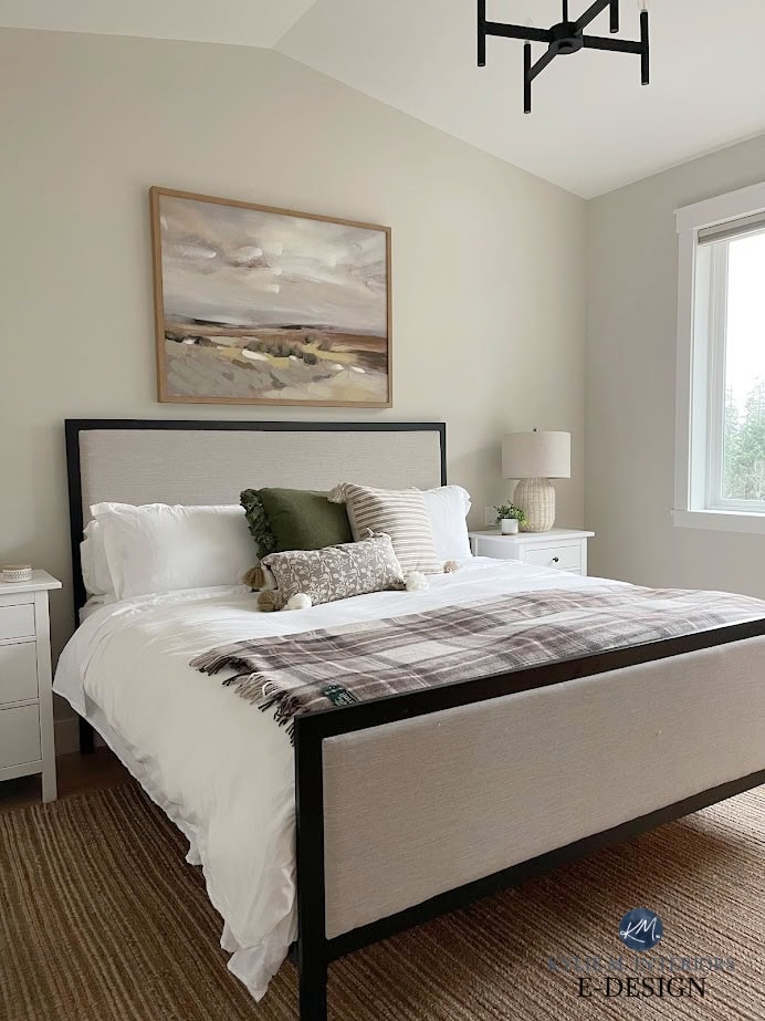
Color Review of Sherwin Williams Aesthetic White
And because you should NEVER choose a paint color by comparing it to itself, here are more colors to explore…
- Sherwin Williams White Duck
- Sherwin Williams Accessible Beige (like a darker, more beige version of Aesthetic White)
- Benjamin Moore Wind’s Breath
- Sherwin Williams Shoji White (coming up next)
Even better, grab my CURATED COLOR BUNDLE to compare Aesthetic White to its peers!
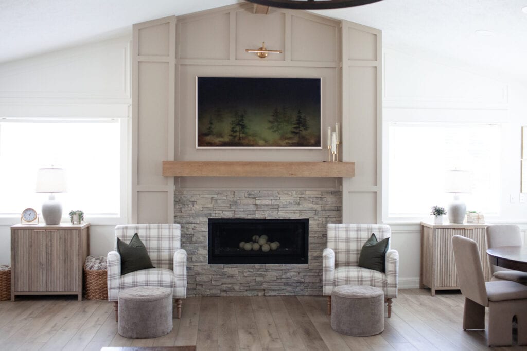
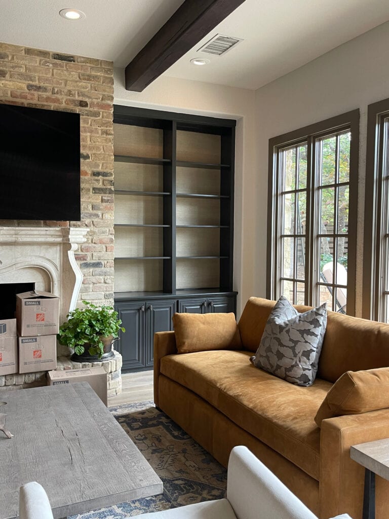
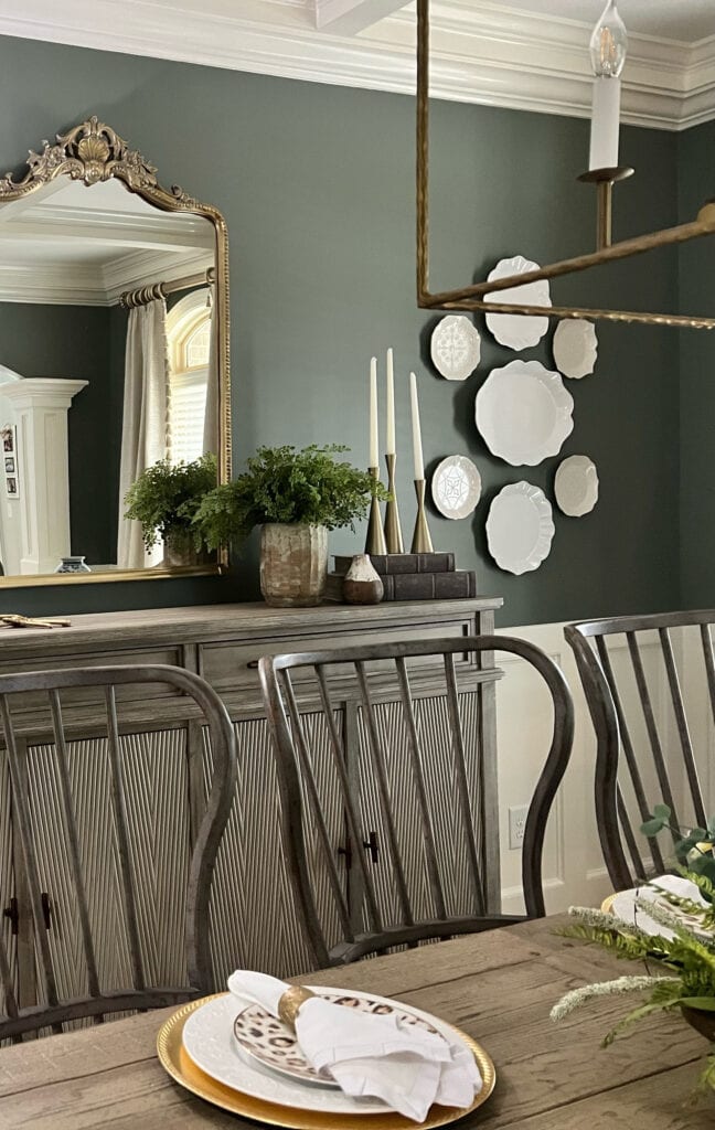
3. BENJAMIN MOORE WILLOW CC-542
If you’re aching for something a bit deeper and darker, you might fall in love with Willow.
However, because I don’t ‘borrow’ images from other Creators (I only use images from my own files), I don’t always have exactly what I need. So, while it’s not on a large scale, you can see Willow on the window trim in this next living room…
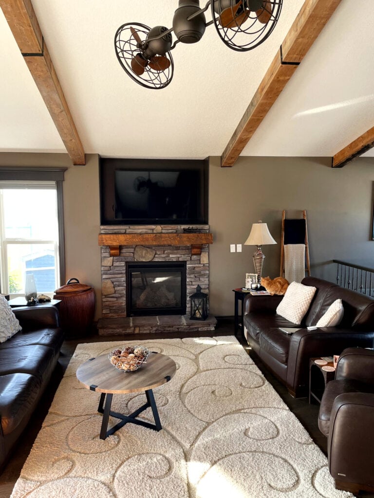
Benjamin Moore Barnboard is on the walls
Willow is a super dark, brown-inspired paint color. I say ‘inspired’ as while it’s brown, it’s super grounded with a gray base. This gray takes the ‘fudgy-chocolatey’ edge off this popular color.
Here’s Willow on exterior door trim with a riotously red-orange front door!
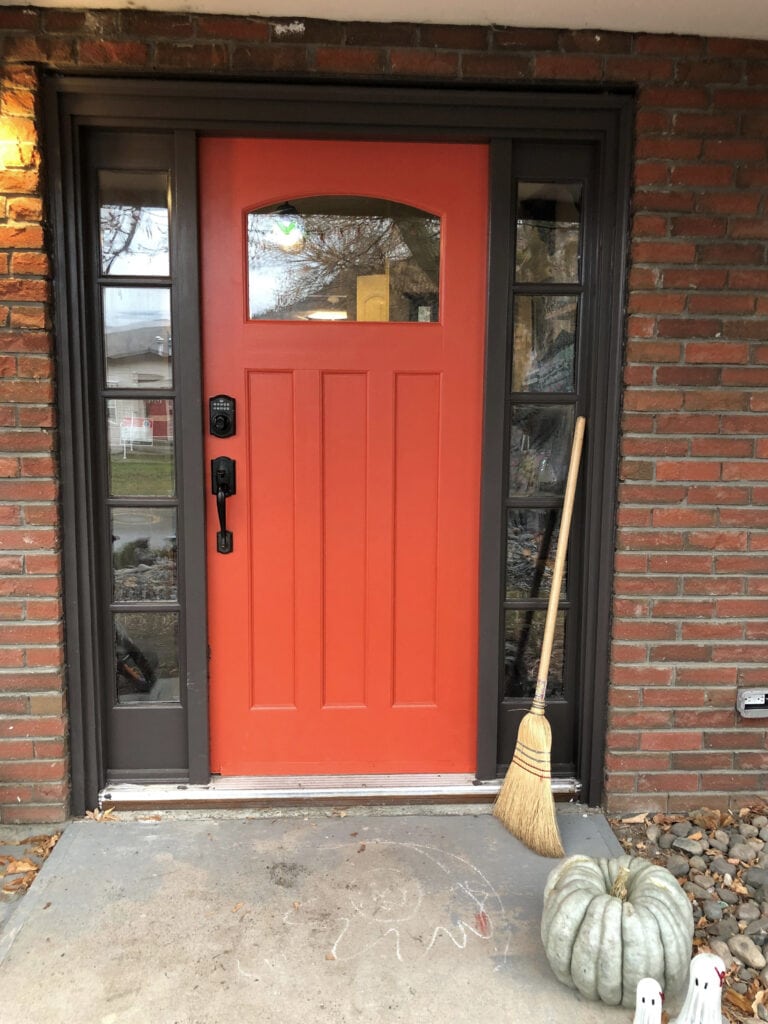
The Best Front Door Paint Colors
So, whereas stronger, richer, sable browns are trending, if your tastes lean toward subtler tones, Willow could hit the spot.
4. SHERWIN WILLIAMS SHOJI WHITE 7042
Shoji White has become popular for walls, trims, and cabinets. Whereas Aesthetic White caters to a subtle beige base, Shoji White picks up just a wink more warmth that could pass as cream in the ODD light but settles as a flexible, warm neutral with little allegiance to one particular neutral – sweet!
As shown next, Shoji White can be influenced by the lighting you cast on it (as can all paint colors).
In this next photo, Shoji White picks up a touch of that ‘almost creamy’ look…
6 Ideas to Update Wood Cabinets
Paint Color Review of Sherwin Williams Shoji White
Shoji White has some great comparables, so be sure to check out…
- Sherwin Williams White Duck
- Sherwin Williams Aesthetic White
- Sherwin Williams Aesthetic White
99.5% of the photos in my blog are from my Online Color Consulting clients, readers, talented photographers, & friends— because real homes deserve to be celebrated (dirty laundry & all!) While not magazine-perfect, they’re packed with timeless (and some trendy) home update ideas & the best, proven paint color choices to help you create a home you’ll love.
5. SHERWIN WILLIAMS NATURAL TAN 7567
Natural Tan is for those wanting some depth on their walls without too much visual weight. With its LRV of 65, Natural Tan is like a lighter, warmer take on the super popular beige – Sherwin Williams Accessible Beige.
Like most trendy beiges and tans, Natural Tan is muted, unlike the outdated beiges from the early 2000s. Just be careful, as many interior finishes (in particular tiles and carpets from the 2000s) cater more to beige (orange undertone) than tan (yellow undertone).
Paint Color Review of Sherwin Williams Natural Tan
Check out my Online Color Consulting packages!
If you want to compare Natural Tan to similar shades (one of the most IMPORTANT parts of finding your best paint color), check out the following…
- Sherwin Williams Canvas Tan
- Benjamin Moore Manchester Tan
- Or see the full range in my CURATED LIGHT TAN COLOR BUNDLE
6. BENJAMIN MOORE PASHMINA AF-100
I’ve been crushing hard on Pashmina for years, so I’m happy to be able to finally include it!
Pashmina is a soft, medium-depth greige. Now, greige can lean more gray or beige – Pashmina leans more beige, which gives it a super muted approach to this type of warmth.
How to Update Granite Counters Without Replacing Them
With its LRV of 44.2, Pashmina adds depth to a room without as much visual weight as a more solid medium-depth color.
Benjamin Moore Pashmina Color Review
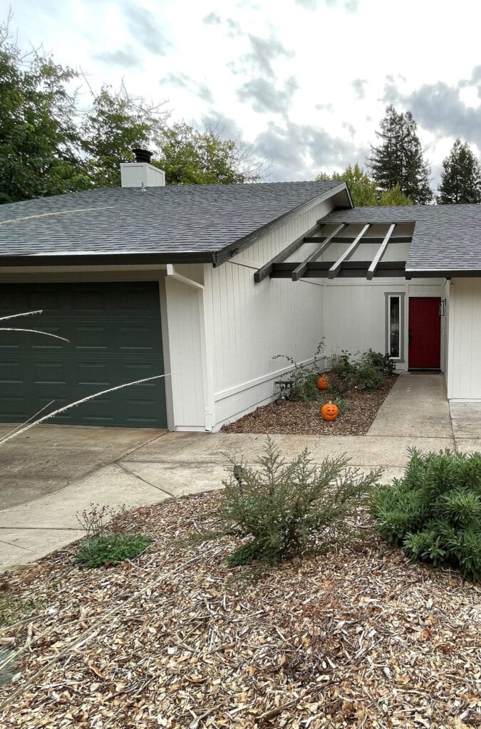
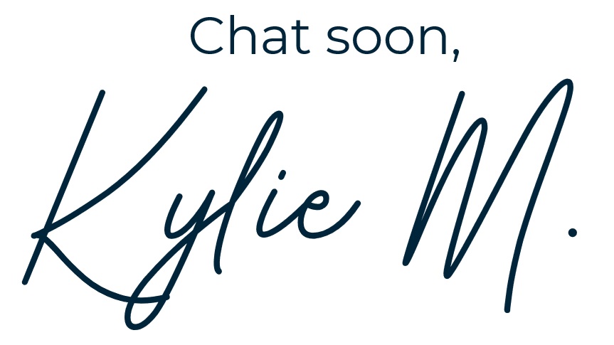
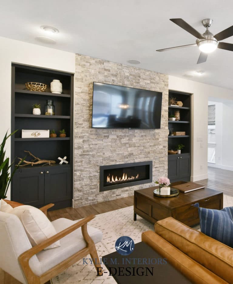
7. SHERWIN WILLIAMS IRON ORE 7069
The all-black house trend was HOT in previous years. While we still see the odd one pop up, many opt for a slightly more subtle approach. An all-black home can look wicked pretty, but boy, it sure needs to be the right house, style, and location (and those are few and far between). Otherwise, it sticks out like a sore thumb.
Instead, many opt for black details, such as the shutters on this next cutie-patootie exterior. The brick is painted (limewash), Romabio Avorio White (similar to some of my favorite warm off-whites), and the shutters are Iron Ore…
The Best Teal & Blue Front Door Paint Colors
Iron Ore is a soft black paint color. While it still offers a ton of drama and contrast, it’s not as sharp and final as a true shade of black.
Iron Ore built-ins with Sherwin Williams Aesthetic White walls and medium-depth greige trim
This goes for kitchen islands and interior accents, too. Sure, some homes call for a striking, contrasting shade of black, but others suit a more muted, softer approach—one offered by Iron Ore.
Main cabinets painted Sherwin Williams Agreeable Gray
Iron Ore is a soft black with very muted green undertones. With its LRV of 6, it nods at the super blacks like Tricorn Black without being as sharp or drastic.
FULL Paint Color Review of Sherwin Williams Iron Ore
While I’d love to give you colors that are similar to Iron Ore, there aren’t any. Sure, there are other blacks, but they’re LEGIT black or lean into other undertones. If you’re still curious, check out…
- Benjamin Moore Wrought Iron
- Sherwin Williams Tricorn Black
- Sherwin Williams Peppercorn
8. SHERWIN WILLIAMS PEWTER GREEN 6208
Pewter Green is hitting the streets hard. With a commitment to dark green and a neutral, calming gray base, Pewter Green shows up on accent walls, kitchen cabinets, islands, and even garage doors!
The Best Medium to Dark Green Paint Colors
Coming in a HOT second place is Sherwin Williams Retreat. While it’s not as dark as Pewter Green (which I personally prefer), it has the same approach to color and style…
Paint Color Review of Sherwin Williams Retreat
While dark green cabinets aren’t as popular as they were, they’re still showing up en force. However, green rooms are still pretty on point.
Again, you must compare paint colors—never choose a color based on itself. Check out my CURATED DARK GREEN COLOR BUNDLE and/or read my blog post on The Best Medium to Dark Green Paint Colors.
9. SHERWIN WILLIAM PEARLY WHITE 7009
If you’re still on the white train but want to tone things down considerably, check out Pearly White. It’s a great transitional shade between warm white and cream, with a dusky gray backdrop calming it down.
Pearly White doesn’t cater hard to any particular undertone, but a tiny flash of green pops up the odd time. I wouldn’t expect it, but check for it and compare it to similar shades to see which best suits your interior finishes.
Here are some great comparisons…
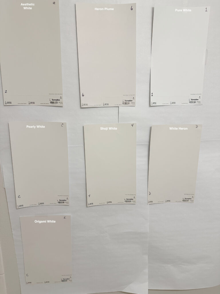
SW Aesthetic White | SW Heron Plume | SW Pure White | SW Shoji White | SW White Heron | SW Origami White
10. BENJAMIN MOORE NEW LONDON BURGUNDY HC-61
If you’re REALLY into trends, you might have noticed a resurgence of burgundy-inspired colors. If so, check out New London Burgundy, which takes a traditional approach to this gorgeous shade.
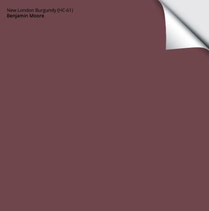
Get your Peel & Stick sample of New London Burgundy HERE
For more gorgeous burgundy hues, check out The Best Burgundy Paint Colors
11. SHERWIN WILLIAMS ANONYMOUS 7046
If you’re looking for something with a moody, earth-toned, organic depth, take a look at Anonymous.
Anonymous is a medium-depth (on the darker end of the range) greige paint color, which we know thanks to its gorgeous green undertone.
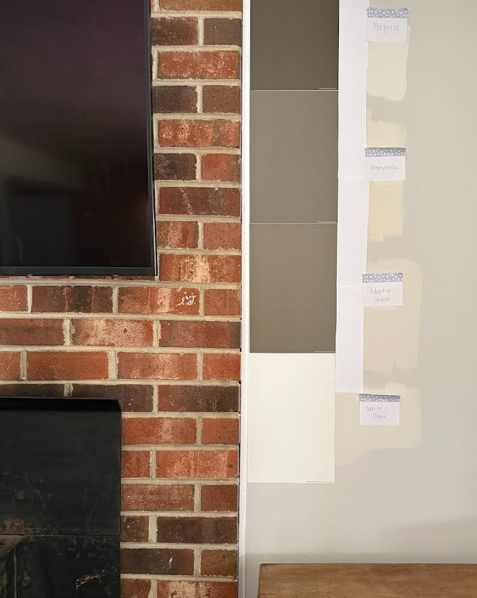
SW Porpoise | SW Adapative Shade | BM White Dove
I also love Porpoise, the top sample in the above image. This is especially true on accent walls and kitchen islands.
The Best NEUTRAL Earth-Toned Paint Colors
Of course, there are other things to consider when picking your best paint colors, like exposure, room size, interior finishings, and personal tastes, but these ideas should get you off to a good start!
READ MORE:
The Best WHOLE HOME Warm Neutral Paint Colors
11 Best Warm Neutral Paint Colors That AREN’T BEIGE!
Get the best paint color advice…
Check out my E-design and Online Colour Consultation Packages
*Updated in 2026 for relevent, new content and images
https://staging2.kylieminteriors.ca/wp-content/uploads/2015/01/the-best-rustic-farmhouse-or-country-style-paint-colours-using-benjamin-moore.-Great-for-interior-and-exterior.jpg
which color is being used for the trim and siding on this pic
Hi Rebecca! It actually isn’t my project but that’s a stain you’re looking at, rather than a paint colour – which makes it much trickier. It could easily be a blend of a gray stain with a more brown/purple base one.
Love the colors is this article, but love White Dove most of all. I’m painting my entire 1st floor White Dove in my reno of a historic house (with Palladian Blue on my LR/DR ceilings)! A relative who is an interior decorator said to carry the White Dove up to the entire 2/3rd floors (said not to paint the bedrooms colors). I picked out an analogous BR/bathroom colors scheme based off my Stratton Blue exterior, because I can’t imagine not having the upstairs bedrooms colors. Is he right? Is this a new decorating direction? Even for a historic house (as opposed to open concept)? Thanks for all you do-you are appreciated!!
Hey Julie, thank you for the lovely note! Now, each to their own, but you can absolutely do your bedrooms in different colors – I mean, I suppose if someone likes consistency and simplicity, one color throughout is nice, but it’s definitely not necessary…at all. All my my bedrooms are different colors and I love it! You have to LOVE the home you live in and live in colors you love. Even for resale, I wouldn’t say that ‘all white’ is all right. A well chosen palette can make any home shine, but ESPECIALLY a historic home – they LOVE having a bit of color and personality!
Hooray! Thank you!
Hi, Kylie, in the Romantic Glam palette, what is the last color? It looks like there are six colors but only five identified. I love that last color. Thanks!
Hi Alison, of course the ONE i didn’t mention is the one you love – don’t you hate that! To get a colour along those lines, check BM Rockport Gray, BM River Reflections or BM Cape May Cobblestone, see if one of those feels good!
Which would be best two colors for an open floor Plan for a living room and kitchen color!?
On the snowbound / agreeable grey kitchen cabinet photo, I think you have your colors reversed. Walls look agreeable grey to me , cabinets snowbound.
Nope, that’s definitely the way it is! The sheen of cabinet paint can make a color look a bit lighter :).
H- love your page, lots of helpful information. We recently purchased a lakehouse condo that gets alot of afternoon sun and hhas cathedral ceilings in the living room/kitchen with light wood ceiling panels and beams. The cabinets are older grainy brown colors and then there is a fireplace with large gray and bluish tones. The current paint color is a cream and very yellow and I hate it. What would be a warmer white with no yellow undertones that would coordinate well with older brown wood colors and newer rustic wook colors, along with blue hues. I want to find a complimentary color that creates warmth and ties to all colors. Is Aesthetic white the way to go? I’m not a fan of very white walls. At home we like agrreable grey and that family. But I don’t think grey is the way to go. I just do not like yellow undertones at all or super bright white. Also, where did you find the print over your bed in your lake house? Thank you, Jen
Hey Jennifer, when it comes to warm whites, the warmth comes with yellow – without the yellow you have pink! It’s about finding a white with a passive warmth, so the yellow is toned down, otherwise you’ll have a cool white or a stark white!
Aesthetic White is awesome as it’s actually an OFF-WHITE, not a white, so it sounds like it could be just what you want! As for the lake house, that’s from Urban Barn (which is only in Canada, although if you google search the image, maybe there’s somwhere in the states that provides the same piece?)
Hi! We are getting ready to do a major renovation in our home. New cabinets, new flooring….new windows….etc… We are painting the kitchen cabinets some form of white. I’ve been thinking either Alabaster or White Dove. Which would you go with and then which wall paint color would you go with. Trying to keep it light and airy looking. Warm and inviting. The fireplace will have some gray stone along with a gray panel backdrop. My sofa is light blue and probably going to accent with white/gray backsplash in the kitchen. Sorry this was so long.🤪 P.S I’m open to others suggestions on the cabinet color.
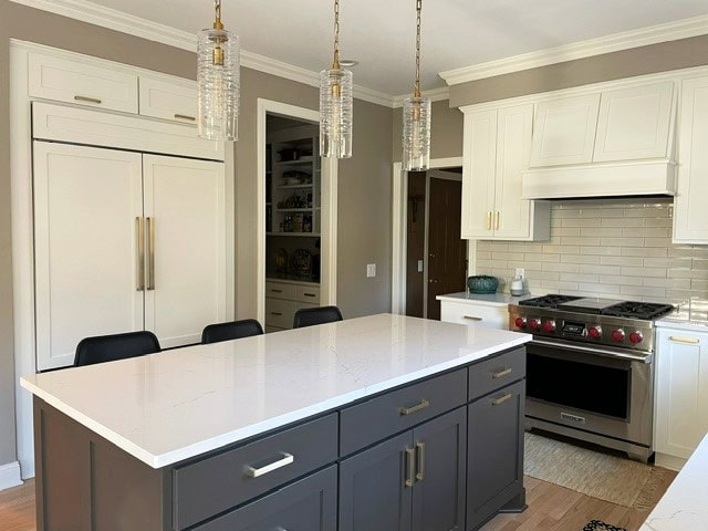
Hi Kylie, do you know what the wall color is in the photo above with Agreeable Gray cabinets and Iron Ore kitchen island? Thanks in advance!
Ahhhh, that’s SW Snowbound. If you ask me, it’s not my FAVORITE combo (my client moved into the home with it), but it just barely works! I would’ve preferred the simplicity of SW Pure White 🙂