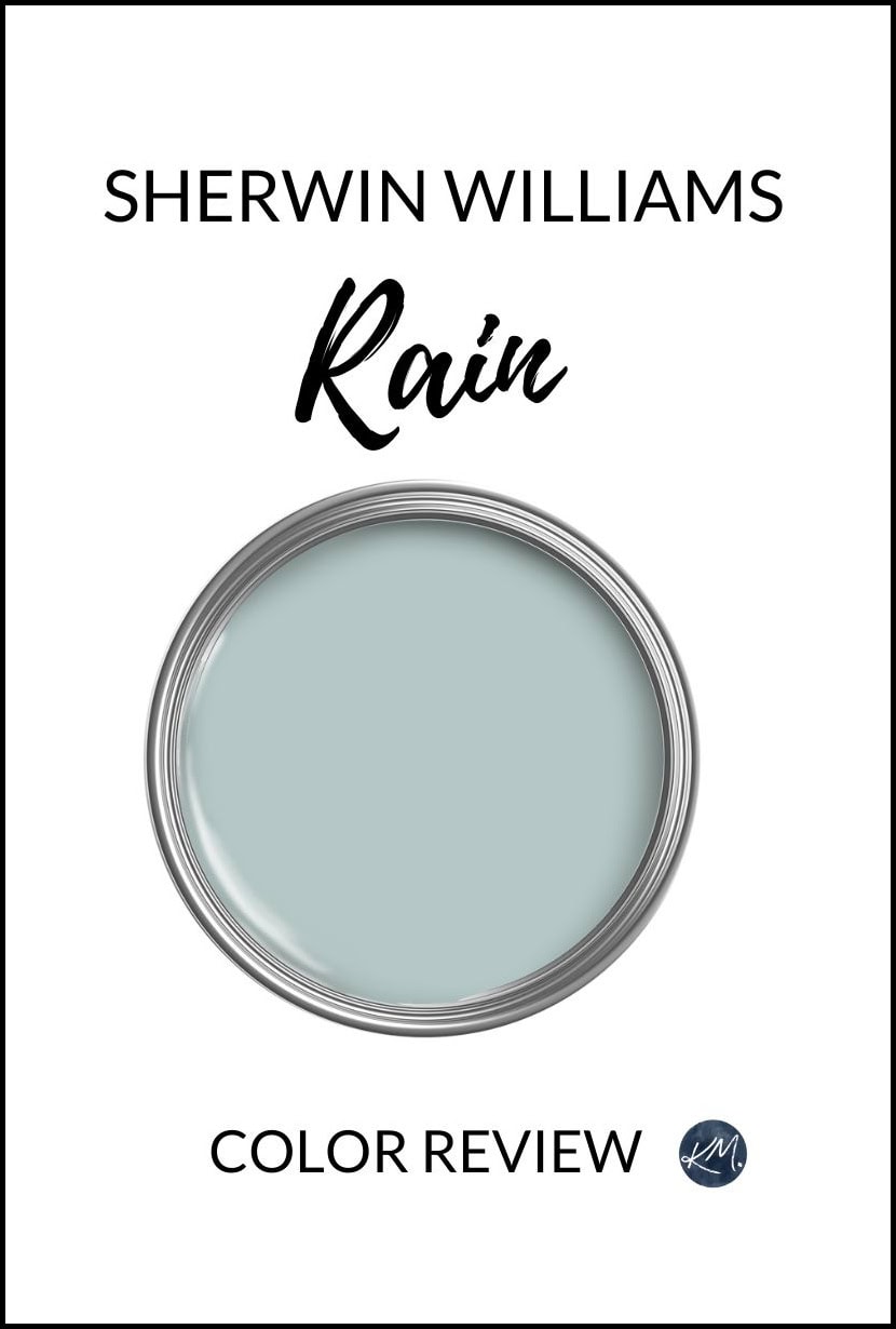
Sherwin Williams Rain is a light, cool blue paint color. It works best on interior walls, especially single rooms like bathrooms and bedrooms, as well as subtle accent walls.
Blue paint colors like Rain can shift their appearance based on their surroundings, including changes in exposure and interior lighting. These can cause Rain to be more gray or more blue than expected.
When sampling colors, learning about their LRVs and undertones helps you understand how they might work in your space. So, let’s see if the clouds will open up or if this gorgeous color will Rain on your parade…
IS RAIN MORE BLUE, GREEN, OR GRAY?
Without a doubt, Rain is a blue paint color. While it has a dollop (or 2) of green and a smattering of gray to calm it (those are its undertones), it’s most definitely a ‘color-forward’ shade of blue.
But don’t worry, just because it’s color-forward doesn’t mean it’s overwhelming.
IS RAIN TOO BLUE OR TOO GRAY?
Whether a color is ‘too anything’ comes down to what you want – there isn’t a clean-cut yes or no answer.
This is why sampling a color in your space, with similar shades, under different lighting and in different areas, is so friggin’ important!
In my experience, Rain comes at its color with a calming, spa-like approach. This makes it less ‘cheerful’ and more ‘relaxing’ than some brighter shades of blue. While it’s too blue for some (myself included, as I prefer more gray-heavy blue-grays), MANY of my Online Color Consulting clients who love blue, think this shade is fab – fewer people find it too gray.
Here’s your Peel & Stick sample of Rain…

RAIN’S LRV & DEPTH
Sherwin Williams says that Rain has an LRV of 49, making it a light-medium depth paint color. Whereas the ‘average’ whole-home paint color is in the white, off-white, or light range, light-mediums have a bit more depth and contrast with white trim (which we’ll get to shortly).
A combination of depth and commitment to color means that Rain is far more popular in single rooms – not for whole homes. It can even be a lot for open-concept spaces – but hey, you do you, boo!
Not sure what LRV is? Learn about it HERE!
If your main walls are white or off-white, Rain’s depth makes it a pretty accent wall color. It adds interest without too much contrast or visual weight.
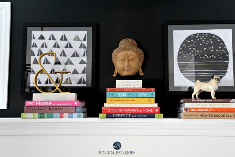
99.5% of the photos in my blog are of REAL HOMES from my Online Color Consulting clients, readers, and friends. While not always magazine-perfect (dirty dishes & all!), they’re packed with ideas and proven color choices to help you create a home you’ll love.
COLORS THAT GO WITH RAIN
While some blues can be fussy about their color partners, Rain is reasonably flexible thanks to its green-gray undertones. So, if you’re looking for a color for an adjoining room, adjoining walls, accents, etc., these colors should get you going…
- WARM OFF-WHITES: You’ll find a decent whack of warm off-whites that pair well with Rain, especially in an adjoining room.
- WARM WHITES: With Rain in mind for an accent wall, warm whites can be gorgeous partners.
- BRIGHT WHITE PAINT COLORS: If you want a cleaner, crisper contrast, look at brighter shades of white – heck, Rain can even handle cool white paint colors!
- GREEN PAINT COLORS: While not every shade of green works, find comparable greens with similar degrees of gray, and you’ll make a gorgeous room-to-room palette.
- BUE-GREEN-GRAYS: Darker shades of blue-green-gray with a similar balance to Rain can be pretty in adjoining rooms (but too much to be in the same room as Rain, other than on accent pieces).
- CREAM PAINT COLORS: The yellow undertone in some of the popular cream paint colors can be a beautiful, opposite partner to the cool look of Rain.
WHITE TRIM OR CABINET COLORS THAT GO WITH RAIN
While some love the play of Rain against creamy warm (stronger yellow) trims and cabinets, I suggest a more modest, subtle approach with whites like…
- Sherwin Williams Pure White for a soft, but not overly warm contrast
- Sherwin Williams White Snow offers a cleaner, brighter contrast without being a cold or stark white
- Benjamin Moore White Dove is warmer than Pure White and a pretty partner to Rain
I can’t wait for my readers and clients to send in more photos of Rain, so I can share them with you!
WHERE RAIN LOOKS BEST (& WHERE IT DOESN’T)
Just because a color is badass and beautiful doesn’t mean it works in every situation. So, let’s look at some of the best and worst uses for Rain, starting with a shortlist, and then hitting some specific details…
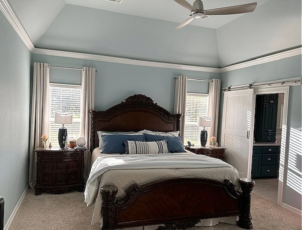
- Rain is best in a single room, especially bedrooms and offices.
- It’s a beautiful accent wall color for those wanting a more subtle, calming look.
- Rain can be pretty on cabinets, but it isn’t common or popular (unless you’re in a beachy home).
- It’s rare to find Rain on an exterior, although it’s an interesting, subtle choice for shutters if you have white siding or stucco.
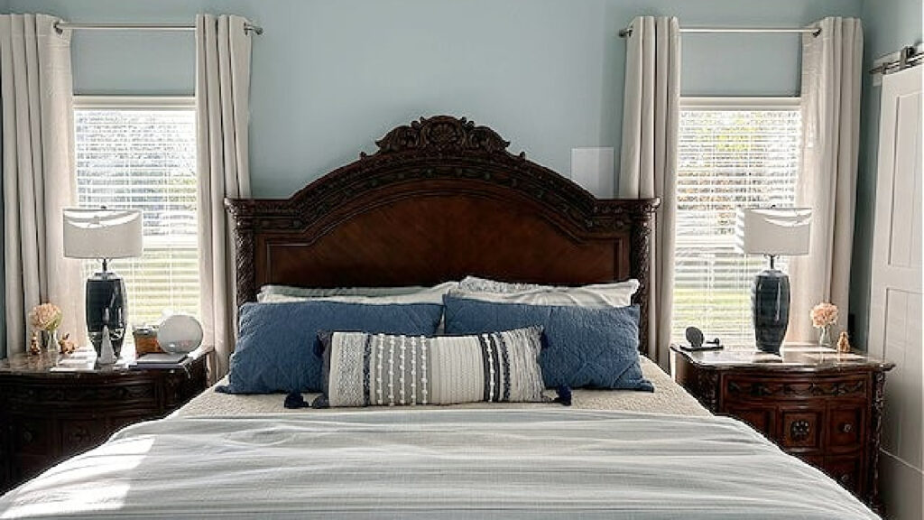
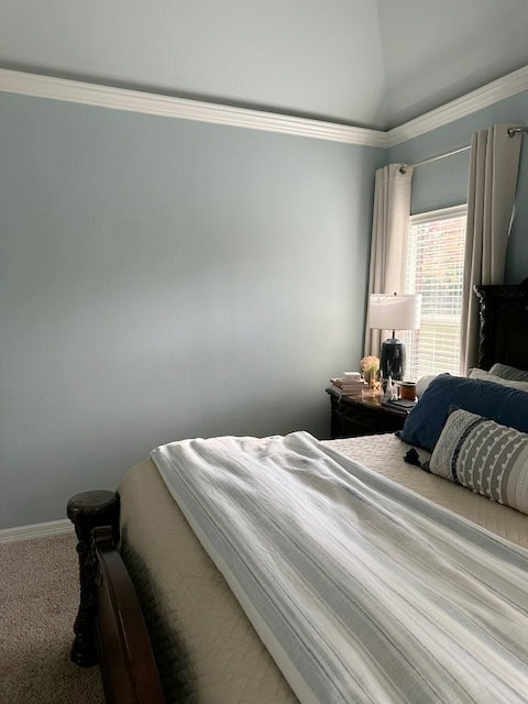
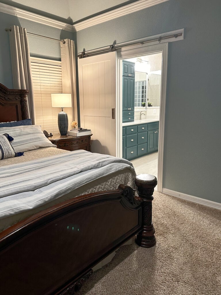
RAIN AS A BEDROOM OR BATHROOM COLOR
Rain can be a gorgeous blue or green paint color for your primary or guest bedroom. This is thanks to its gray backdrop, which stops it from being too wild, crazy, and colorful.
Those who love it say that it’s calming and beachy. Those who don’t love it often find it a bit too blue for the look they want (each to their own).
As for bathrooms, while it’s said to be popular, it’s fussy with bathroom finishes, especially those from the early 2000s that are travertine/beige/taupe/etc. I’d rather see Rain in a bathroom with more white and gray finishes and features.
RAIN AS AN ACCENT WALL
While accent colors are more often darker or stronger, if you want a soothing, calming, lower-contrast look, Rain can be friggin’ gorgeous.
In this case, your other walls should likely be painted a bright or warm white paint color.
IS RAIN A GOOD COLOR FOR AN OFFICE?
Where you have an in-home or out-of-home office, Rain can be gorgeous. Its green-gray undertone adds some calm balance.
However, if you’re in a clinical setting (e.g., counselling), it’s important to note that Rain is a cold paint color. You’ll want to add some softness and warmth via contrasting accent colors, texture, and wood stains.
I’d be more likely to suggest Rain in an office with white or oak furniture. As for red-stained woods or black furniture, Rain doesn’t feel quite as calming.
RAIN IN DIFFERENT LIGHTING SITUATIONS
Rain is responsive to its surroundings, so pay attention to your room’s exposure and interior lighting before slappin’ it on your walls!
NORTH-FACING ROOMS
Rooms with northern exposures look cool with a gray cast. Whether they’re BRIGHT or not depends on how big your windows are and whether they’re blocked at all!
As for whether Rain is a good choice, it comes down to the look you want. Personally, I think Rain is a bit too cool for north-facing rooms. Often, blues with a bit more green settle a bit better and don’t look as cold.
EAST-FACING ROOMS
East-facing rooms look lovely, with a softer kinda bright in the morning. However, the afternoon light can make a room look flatter than me in Grade 10.
The reason I like Rain for this exposure is that while it’s not overly spicy, it has enough COLOR (chroma) to help balance that dull, flat light.
SOUTH-FACING ROOMS & AFTERNOON WESTERN SUN
Rain is a dream for south-facing rooms and those with west-facing afternoon sun – these rooms can look HAAAAWT.
The Best Paint Colors For South-Facing Rooms
Rain comes in with a refreshing balance of cool blue-green hues, adding much-needed cool vibes to an overheated space.
RAIN IN DARK OR SMALL ROOMS
I wouldn’t hesitate to use Rain in a dark or small room. First up, a small room is small no matter what color you paint it. Sure, a white or off-white can make it ‘look’ larger, but it can also look boring. Rain adds interest and color to a room that might just need that.
Don’t expect it to make a small or dark room look big – that’s not its job.
As for a dark room, some other shades don’t have enough blue to come to life in low light. Rain’s degree of color is awesome, adding personality without going overboard.
READ MORE
The Best Light Blue Paint Colors
The Best Light to Medium Blue-Green Paint Colors
Get the best paint color advice with Kylie M’s Online Paint Color Consulting.